
Background
Airba Fresh is a food delivery service from Kazakhstan, the distinctive feature of which is a wide range of fresh organic products. Its important component is the service and emotions from interaction with Airba Fresh.
Task
Create an image of a customer-oriented and friendly delivery service that reflects the main mission of the service – customer care and the highest quality of fresh products.
+ declare the freshness of products through a metaphor. + stand out from competitors in the market.
Restrictions
- The color of the logo excludes the colors used by competitors, including the colors of large banks in Kazakhstan and the red color as well.
- By the structure of the logo, because part of the logo AIRBA was given initially
- Do not use the image of food products in the logo.
Decision
Having conducted design research, we concluded that modern successful companies use emotional logos. We have developed our emotional character because this is exactly what is absent in the market of Kazakhstan.
The character form emerged in the process of searching for an answer to the question:
“What symbol is able to unite the delivery of fresh products in all countries?”
We analyzed our experience with food delivery services and looked at the delivery process for both the courier and the customer. So, we found something that unites each courier and customer at all stages of interaction…

Concept
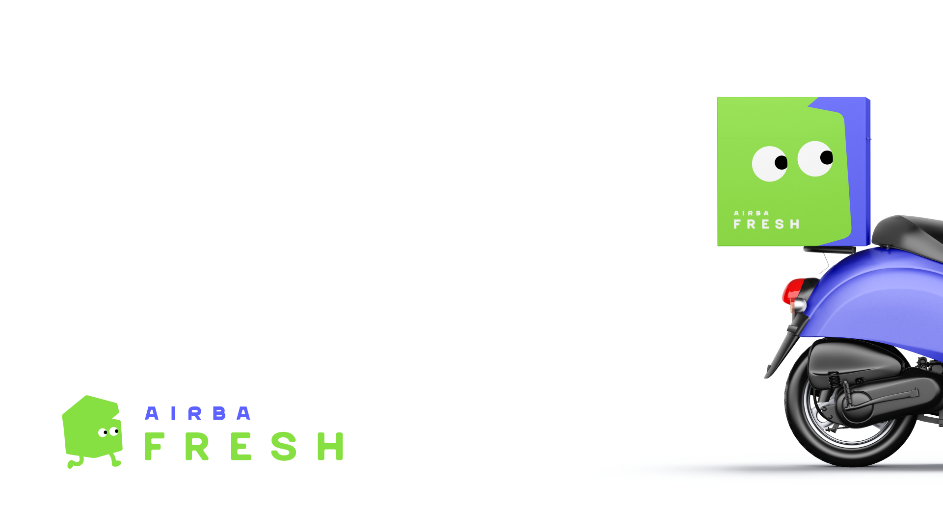
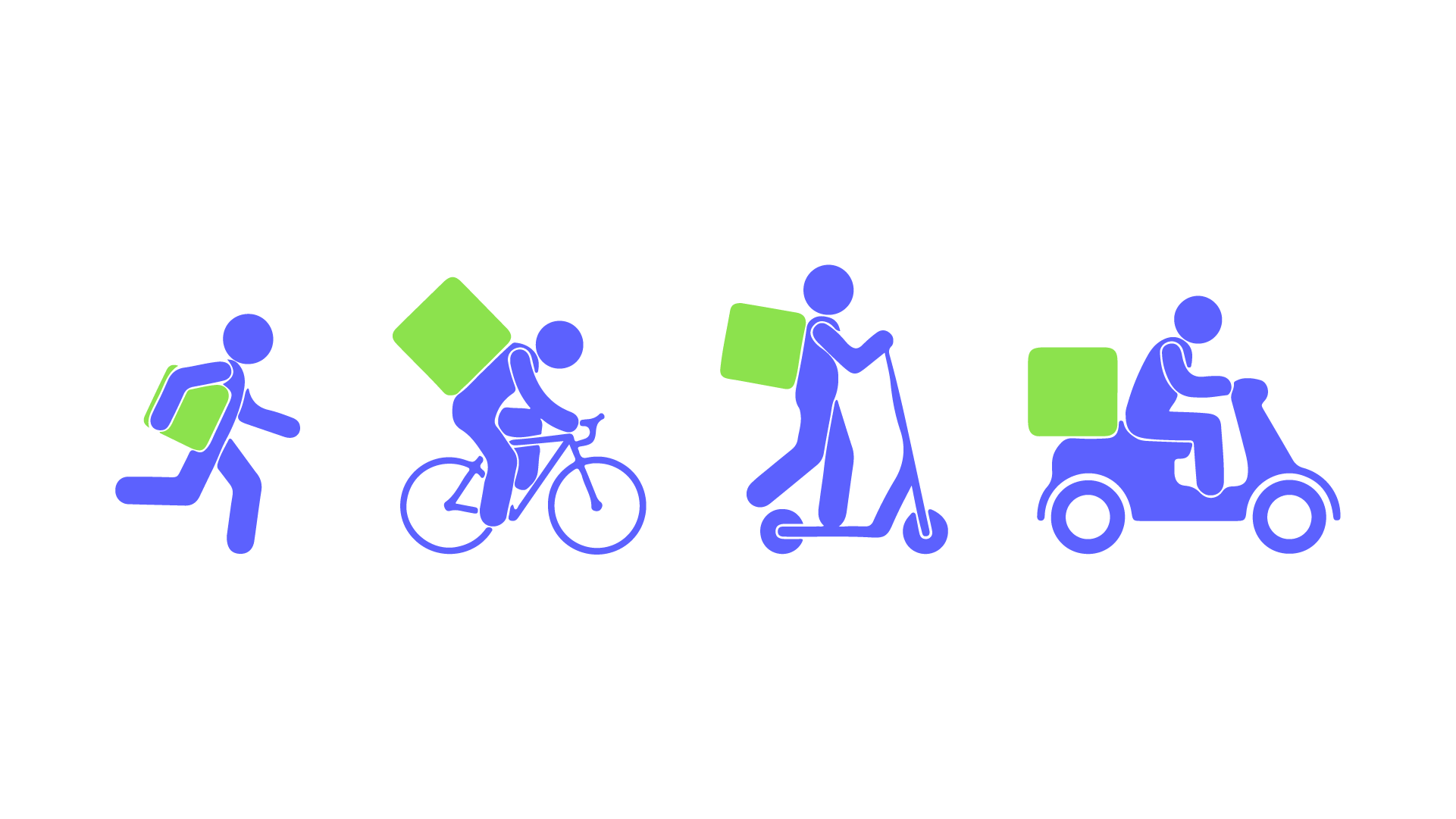
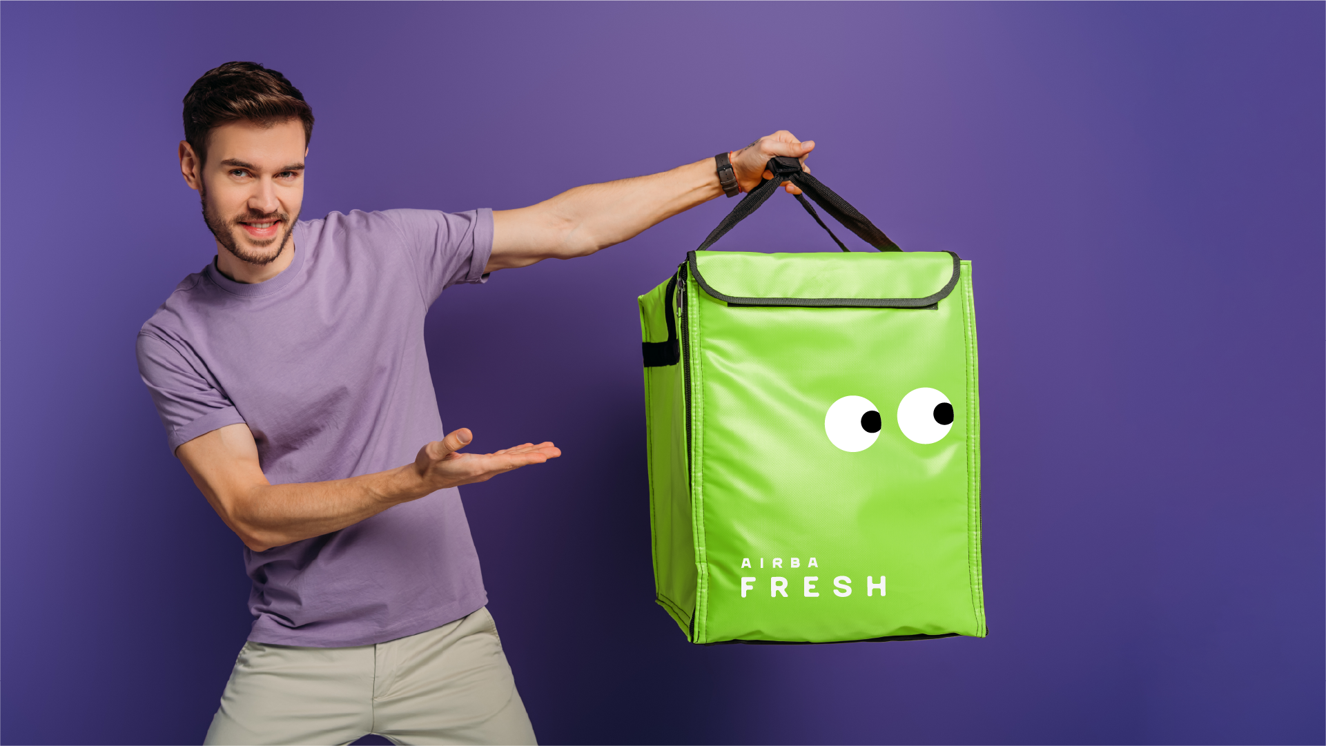
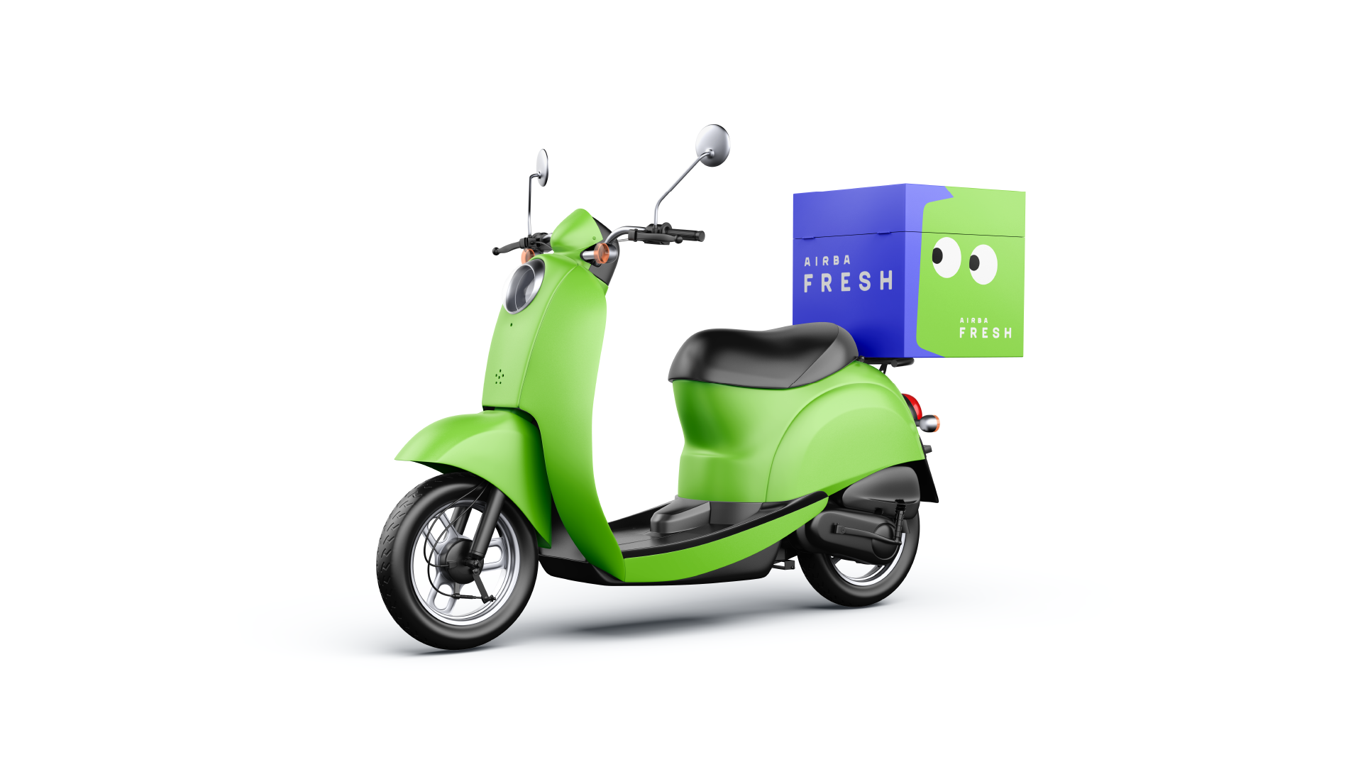
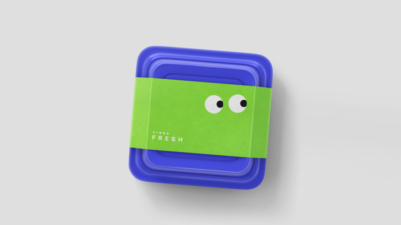
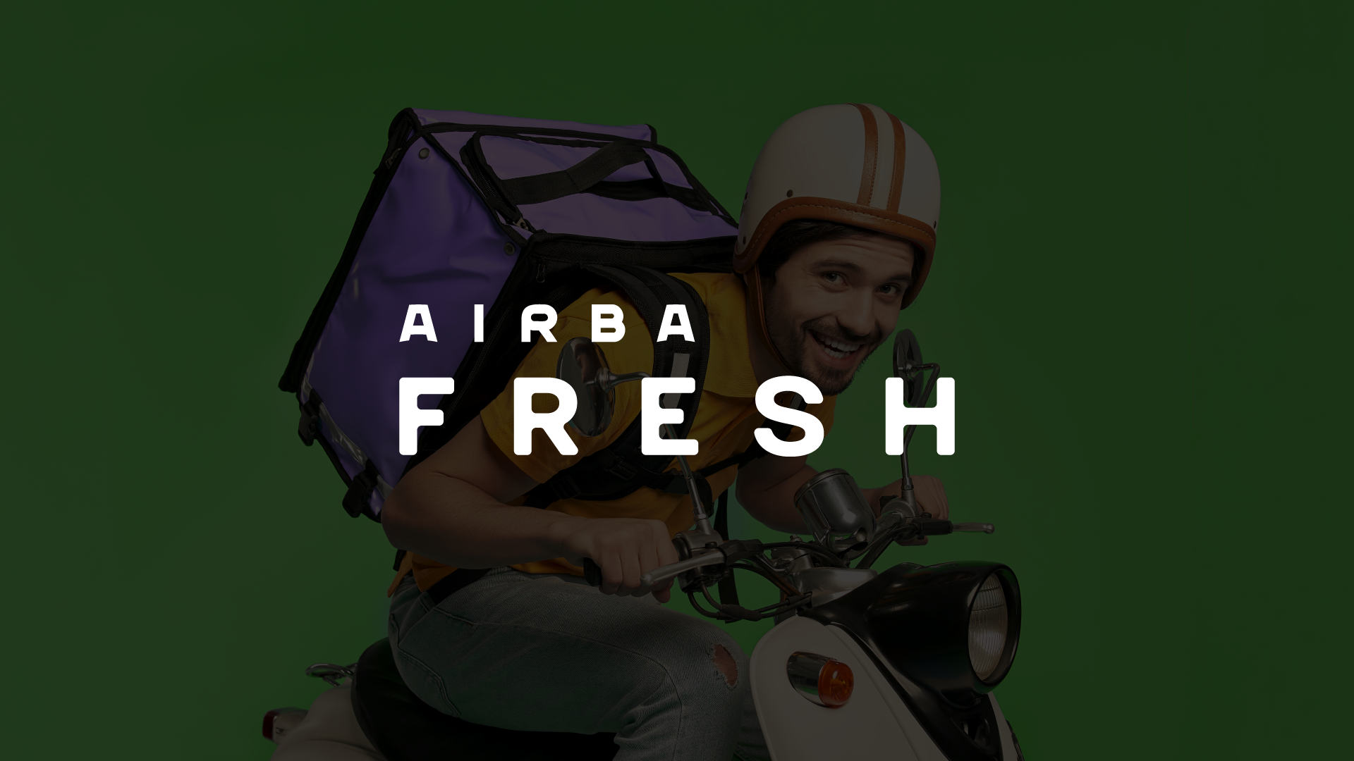
Whether it is a foot courier or a courier on a kick scooter, bicycle, scooter, or any other vehicle – each of them has a thermal bag – a box that keeps products fresh during delivery.
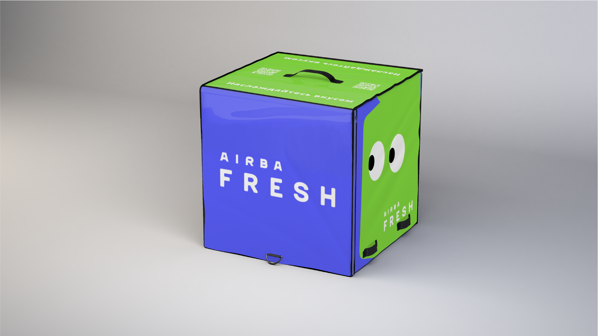
A Thermo box is a square container that keeps drinks cool and food fresh. These qualities are key for us. That is why they are included in the naming – Fresh, which fits perfectly with the positioning.
Finding a graphical solution
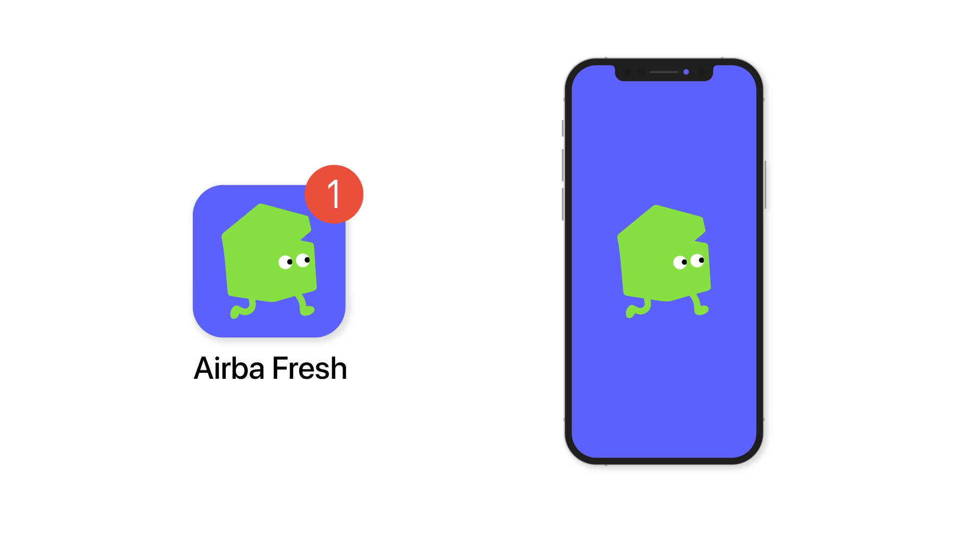
To convey the modernity of the company, we did not use a three-dimensional form – we simplified it and made it lively and easily recognizable.


Despite its expressiveness, the character is not overloaded with details and has a simple shape that works great in a monochrome space and is easy to scale.
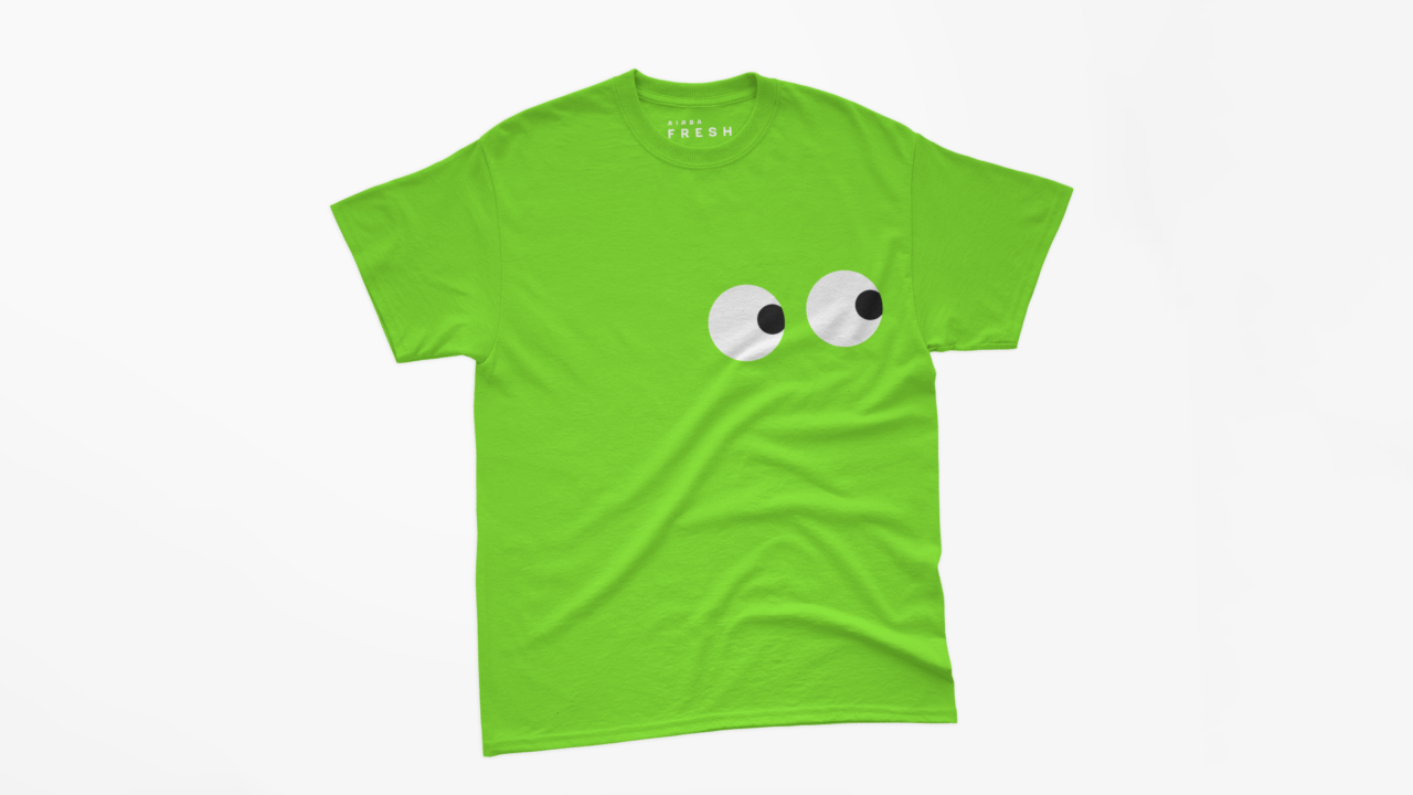
The mascot Thermo box is a universal solution. It is global and understandable to everyone. No one else has it. The character is interesting; it attracts with its dynamics and original form. It is simple but not childish. It is effective and emotional.
Communication
Our character is the basis of the positioning system. It is the keeper of freshness. That’s its mission. It can be revealed from different sides. T.Box easily adapts to the surroundings, it can take any position and knows how to use modern transport, which helps to reduce delivery time.

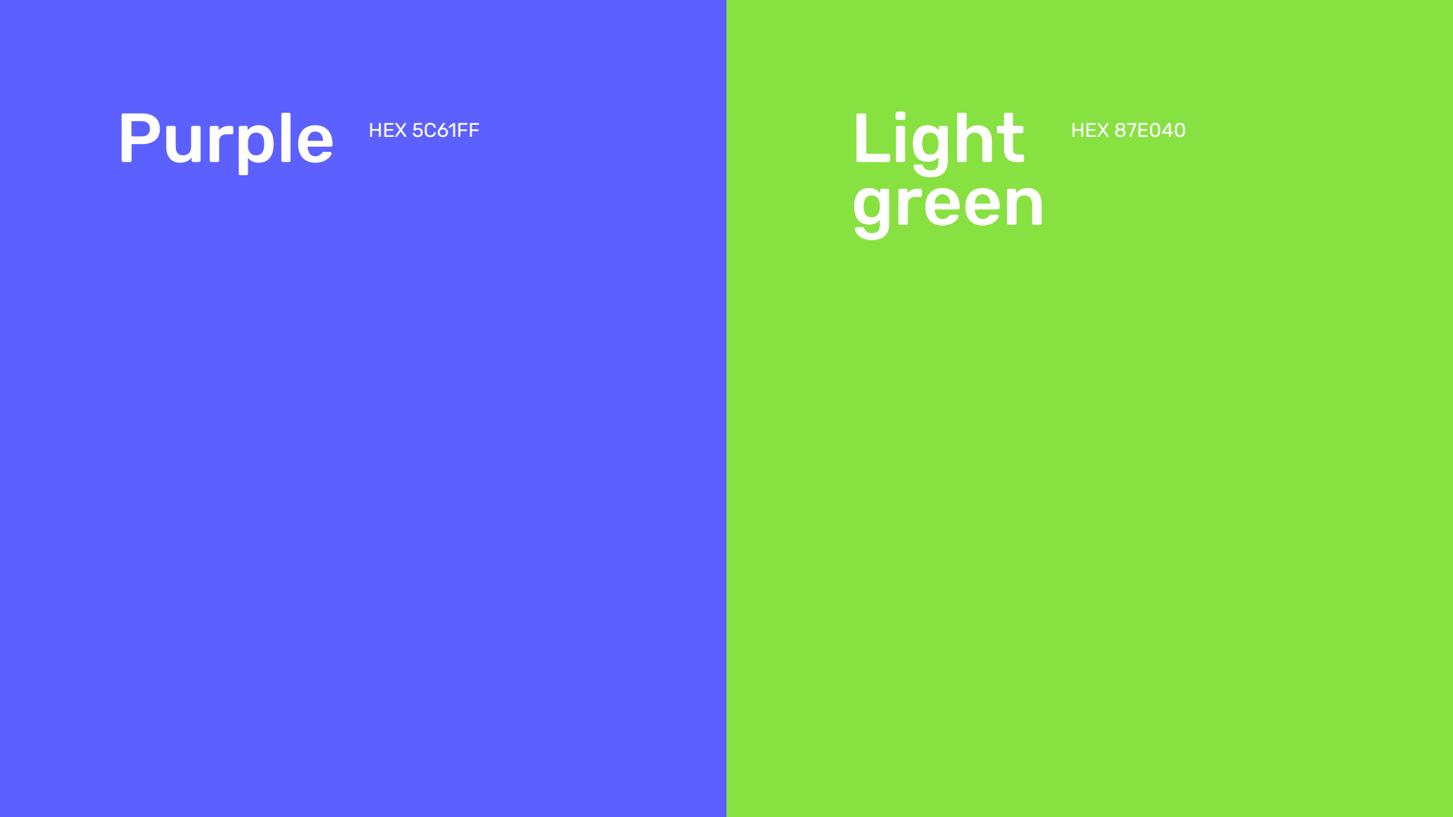
Color palette
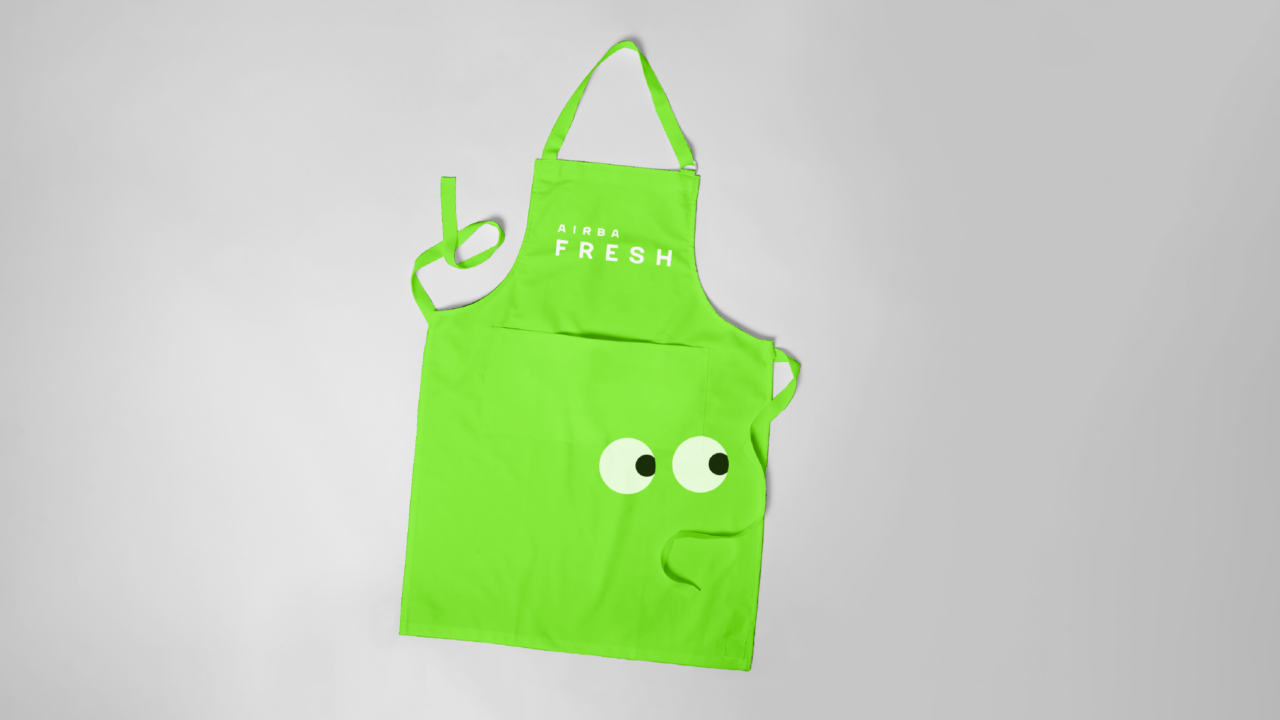
We picked up a modern shade of green, which is associated with spring, energy, and newness, and complemented it with purple. These colors together create a feeling of positivity, cleanliness, and light coolness.
Purple color is closely associated with natural products – plums, eggplant, grapes, blackberries, currants, beets, and figs.
The green color is a symbol of health. It underlines naturalness, ecology, and freshness of production.

Done in 34 days:
Logo concept development – 10 days Logo development – 7 days Logobook development – 7 days Guideline development – 10 days
Credits:
Creative Director – Denis Misyulya Art director – Olga Lobanok Designer – Ilya Pilinoga Designer – Tatyana Shinkevich Project Manager – Veronika Khomyak
