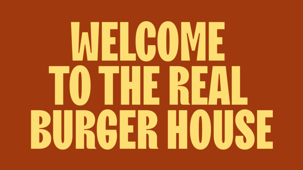
Every project isn’t just about the visible result, but also about the team’s incredible work behind the scenes. Burger House was just such a project for Moloko agency : complex, multilayered, requiring solutions and bold experiments. We decided to tell its story from the first person — through the eyes of those who created the brand step by step.
Denis Misyulya, creative director of Moloko Creative:
“The moment of insight is key. Once you’ve caught it, the key is to hold on and find a working visual solution. For me, it’s always a struggle between options, where my decision will determine how the project will be developed in a business-like manner and how much internal rejection there will be within the team. This is the kind of project where I’m delighted, happy, and especially grateful to the “client” because they didn’t accept the first version. It was a good one, by the way. But after that rejection, I was able to delve deeper and find something that won’t be outdated for many, many years to come”.
Alena Urbanovich, illustrator at Moloko Creative:
“The way the project looked during its turbulent inception is completely different from what you see in the final product today. All the internal processes — briefing, sketching, discussion, color scheme — were reborn several times, not only in my hands but also in the hands of the designers. Colors and shapes changed, new forms emerged, all complemented by the design, which also had its own distinct approaches. The collaboration between the illustrator and a huge team of marketers, designers, strategists, and others involved in the brand book, including the client — was like working on a giant layer cake, where everyone contributes to the filling, and in the end, you see new elements, even in your own work”.
Lyuba Korzan, brand designer at Moloko Creative:
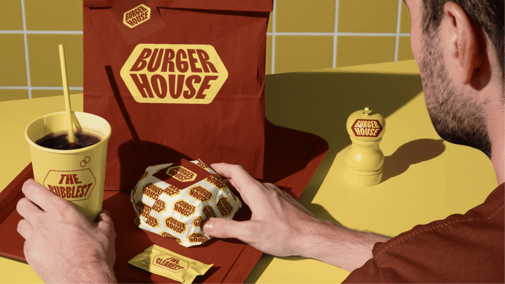
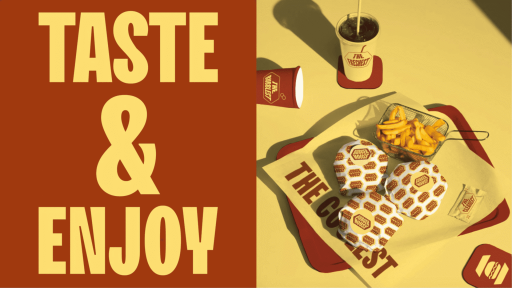
The Burger House branding is based on a simple yet brilliant idea: the box as the burger’s home. And this form became the foundation of all communication. Throughout the project, we discovered that the box is so dynamic and flexible that it can be worked with like play dough: no matter how much you experiment, you never run out of ideas. The core form has become a recognizable and understandable tool that keeps the brand on its toes and prevents boredom.
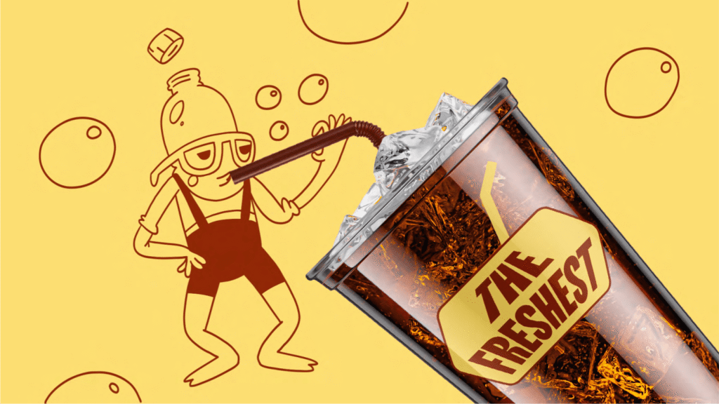
Burger House’s colors — mustard and barbecue — have a retro flair, evoking appetite and that nostalgia for an unforgettable taste. It’s a palette that feels familiar, yet presented freshly and confidently. It combines warmth, flavor, and the brand’s signature character. Burger House was a project where we could really let loose: emotive characters, vibrant graphics, and wordplay. And all within just three colors. It’s a case of maximizing expressiveness with minimal resources.
Margarita Tikhonovich, motion designer at Moloko Creative:
The animation, from concept to final render, took four working days. These same four days were the deadline for submitting the festival application. We usually work with Molok in our usual format: “Rita, we need to make it look good, we trust you.” I really like this degree of freedom — it allows me to experiment and adapt the process to the tight deadline. I received a Figma presentation with a proposed sequence of shots and mockups. My task was to build a narrative logic so that the idea of the “burger house” identity was easily understood. The illustrations and characters weren’t initially designed for animation. Grafdiz drew vector illustrations for me as we went along, but time was short, so I only selectively layered the styleframes, often animating them using masks, to meet the submission deadline. I remember my right hand was already starting to hurt from the mouse — I was afraid I might break down and have to finish the animation with my left one 🙂 In the end, we picked the music and added some sounds — the video came together into a cohesive, living story.