A new brand always involves a multitude of interesting challenges, audience research, new challenges, and much more. Lilulines is a highlight of the past year for us, a passion we’ve carried through every stage of the project and shared with everyone who comes into contact with the brand. We share four perspectives on the brand’s origins.

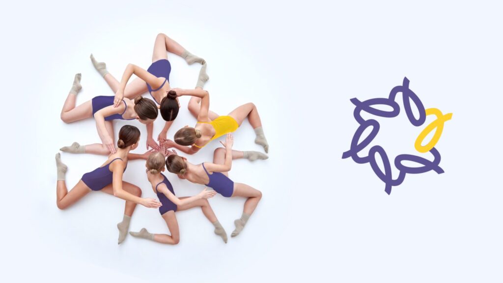
Lines was created following the classic example of starting with nothing and building everything brick by brick from the ground up. And when you have a good foundation, all subsequent developments go like clockwork. I remember the name was a big challenge. We went through many options. It was important to maintain the original ideas and flexibility while still allowing the brand room for international expansion. Lilulines is the perfect solution to this problem. I vividly remember the moment when the identity concept struck a chord. Vlad showed us a kaleidoscope of girls and how they formed the logo. And at that moment, everything just clicked. Everything fell into place.
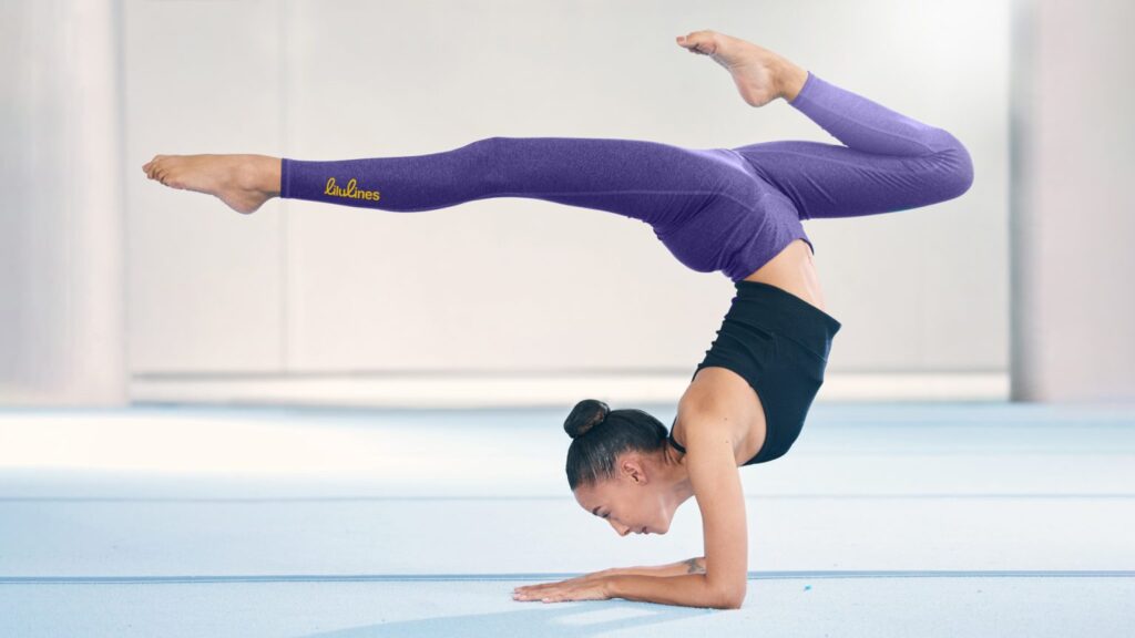
Let me put it this way: this is precisely the kind of project that vividly captures the essence of “branding partners.” The co-founders came to us with the idea of creating a clothing and accessories brand for rhythmic gymnasts. They were still developing the product, shaping the product range, and it was crucial for them to capture the metaphor of lines that speak of the journey, the overcoming, and the aspirations of athletes. After all, it’s also a process of development and achieving new results.
And then they truly trusted us. Not just in words. And together, in our search for insights, true essence, forms, and ideas, we achieved a point where girls in the European market now have the opportunity to adorn themselves with stylish, high-quality items and feel special. And deep down, they can be confident that no matter what new challenge or obstacle they face, they are not alone, they have inner support, and Lilulines is always ready to highlight and support this, no matter how good or bad the day or time.
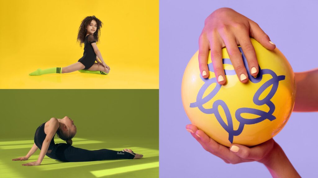
We were tasked with creating a logo and brand identity for a brand of rhythmic gymnastics apparel and accessories that would simultaneously convey the sport’s tenderness, discipline, precision, and strength. We wanted to capture the subtle balance where graceful movement meets rigorous athletic structure.
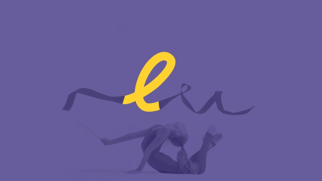
After extensive research and testing, we decided to combine smooth, hand-drawn lines, symbolizing softness, flexibility, and vibrant movement, with geometric sans serifs, which added form, stability, and character. This combination allowed us to achieve the desired balance. In developing the identity, we wanted to convey not only the aesthetics of sport but also the emotional side, the support, unity, and friendship between athletes.
Even though rhythmic gymnastics is considered an individual sport, the girls remain a team, supporting each other. This is how we came up with the idea of a kaleidoscope. It’s based on one main element, which, reflected and combined with other similar elements, forms new patterns. This is a metaphor for the uniqueness and originality of each gymnast, which, when combined with others, creates a complete, harmonious picture. This is how we created an identity that reflects the dynamism, femininity, and inner strength of the gymnasts, as well as their unity, mutual support, and beauty of movement.
The client came looking for a brand strategy and identity. The primary request was for a striking brand that would easily differentiate itself from competitors in a crowded market. A general concept emerged immediately after the brief, but over two weeks of internal team discussions, it was strengthened with unique elements and a vibrant palette. The result was a well-balanced, vibrant, young brand that didn’t feel childish. I enjoyed working both within the team, where everyone reinforced each other’s ideas, and interacting with the client, who completely trusted us and quickly embraced our process.