There’s a kind of startup founder I recognize immediately in a first meeting. They’ve got a product that actually solves something real, a small team that believes in it, and a mental list of everything they need to do before launch that includes «brandbook for startups» somewhere near the bottom — right above «figure out accounting» and below «fix the onboarding flow.»
I understand that instinct. In the early stages, a startup is a hypothesis in motion. Resources are finite. Every hour spent on brand documentation feels like an hour not spent on the thing that actually matters: proving the product works and finding the people who need it.
But here’s what I’ve watched happen repeatedly when founders skip brand foundations entirely: by month six, the marketing materials contradict the app store copy. The social media tone doesn’t match the email newsletter. The designer who built the landing page has a different idea of the visual system than the one who designed the onboarding screens. And the team — now five people instead of two — keeps making inconsistent decisions because nobody wrote anything down.
The answer isn’t a 60-page brandbook. The answer is the right brandbook for startups: minimal, strategic, and built to grow.
Why Startups Are Different from Established Businesses
A startup isn’t a small version of a large company. It’s a fundamentally different kind of organization — one whose primary job is to find a scalable, repeatable model before it runs out of runway. Everything in a startup, including its brand, should serve that job.
This means the brandbook for a startups has to operate differently from a brandbook for a 200-person company. Where established brands need comprehensive documentation to enforce consistency across large teams and multiple agencies, a startup needs a minimal, navigable document that captures the non-negotiables and stays out of the way of the experimentation that growth requires.
The global ADHD apps market reached USD 2.08 billion in 2024 and is projected to grow to USD 7.55 billion by 2033 (Business Research Insights). That’s a highly competitive space — dozens of apps competing for essentially the same anxious, distracted, often underserved user. In a market like that, brand clarity isn’t a luxury. It’s the thing that makes a product memorable when the user is scrolling through a list of near-identical category descriptions.
The DeeDee Brief: Branding a Mental Health App from Scratch
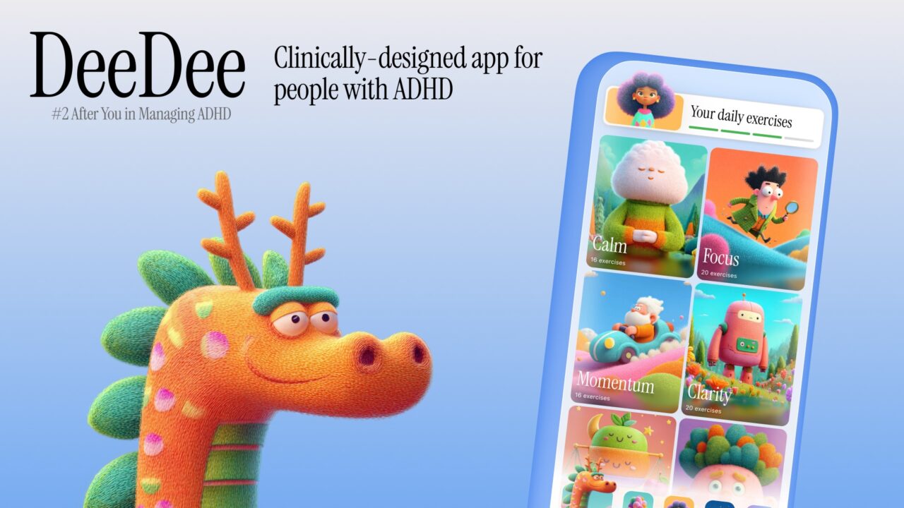
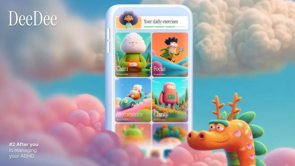
When I worked on the brand for DeeDee — an ADHD daily helper app — the brief was exactly this kind of challenge: a new product entering a real market with a real user need, a small team, limited timeline, and a requirement to establish brand foundations without over-engineering them.
DeeDee’s positioning is genuinely specific. The app describes itself as «№2 after you in managing ADHD» — which is a precise, humble, empowering promise. Not «cure your ADHD» or «become your best self.» Just: we’ll be your second-in-command. That’s a positioning statement that actually understands the user — someone who isn’t looking to be fixed, who already manages their condition with effort and intelligence, and who needs a tool that supports rather than patronizes.
The app’s 11 feature categories — from ASMR music generation to CBT-based thought-reframe cards to Pomodoro timers and mood analytics — are all built around the specific behavioral patterns and emotional triggers of ADHD users: hyperactivity, procrastination, anxiety, irritability. The brand had to speak to all of those without feeling clinical, chaotic, or overwhelming.
The design direction — described as «unique, calming design inspired by neurodiversity concepts» — wasn’t an aesthetic choice. It was a strategic one. The user arriving at DeeDee is often already overstimulated. The visual environment of the app needed to be part of the intervention, not a neutral container for it. That understanding came from brand work done before a single screen was designed.
This is what a minimal startup brandbook makes possible: it captures that kind of strategic clarity early, so every subsequent design and communication decision builds on it rather than contradicting it.
What a Minimal Startup Brandbook Actually Contains
I want to be precise here, because the word «minimal» gets misread as «casual.» A minimal brandbook isn’t a rough draft of a real one. It’s a deliberately scoped document that covers exactly what a startup needs at its current stage — nothing more, nothing less.
For an early-stage startup, that means five things:
1. Mission
Not the aspirational version — the operational one. Why does this product exist beyond making money? For DeeDee, the mission is embedded in the core promise: to be a reliable, non-judgmental daily companion for adults managing ADHD. That’s specific enough to make decisions from. «We help people live better» is not.
2. Values
Two or three principles that actually constrain behavior. Not «we value innovation» (everyone says this and it means nothing). For a mental health app, values might look like: we never talk down to users, we don’t pretend our tools replace professional care, we earn trust through reliability not persuasion. These values should be the kind of thing a team member can use to say «no» to a bad idea.
3. USP — Unique Selling Proposition
The one thing your product does that no alternative does equally well, for your specific user. Not a list of features — a single, defensible claim. For DeeDee, it’s the combination of neurodiversity-conscious design with the breadth of behavioral tools (CBT, DBT, ASMR, Pomodoro, mood tracking) in a single calm interface. That combination is the claim.
4. Target Audience Behavior Profile
Demographics are less useful than behavioral understanding. The question that matters for a startup brandbook isn’t «who are they?» but «when do they reach for our product, and what state are they in when they do?» For DeeDee users: they reach for the app during moments of overwhelm, procrastination spiral, or hyperactivity that’s eating their focus. They’re adults who’ve often spent years being misunderstood. They’re looking for support, not instruction. That understanding should live in the brandbook for startups — because every communication decision flows from it.
5. Strategic Guidelines
How should the brand communicate? What tone is non-negotiable? What does the brand never say? What visual principles apply across all touchpoints? This section doesn’t need to cover every execution — it needs to cover the principles from which every execution can be derived. For a mental health brand: calm over stimulating, direct over corporate, specific over vague, warm over clinical.
A document covering these five areas can be 10–15 pages. It takes a fraction of the time of a full brandbook for startups. And it answers the questions that come up every week in a startup’s creative work.
The Hypothesis Layer: What Comes After the Foundation
Here’s the part that makes branding for startups genuinely different from branding for established companies: everything outside the foundation is a hypothesis.
Your initial positioning is a hypothesis. Your channel strategy is a hypothesis. Your tone of voice in advertising is a hypothesis. Your visual language for acquisition content is a hypothesis. The brandbook doesn’t need to document these at launch. It needs to create a stable foundation from which hypotheses can be tested, evaluated, and either validated or discarded — without losing the core of what the brand is.
This is what I mean when I say a brandbook for startups is a flexible tool. The mission, values, USP, audience insight, and strategic guidelines are the fixed layer — they change only when the fundamental nature of the product changes. Everything else is the experimental layer: campaigns, visual treatments, messaging angles, community voice. These are tested, measured, and evolved.
A consistent color increases brand recognition by up to 80% (G2, 2024). That’s the kind of finding that argues for documenting visual constants early and not changing them with every campaign. But the copy angle you use in a TikTok ad? Test five versions. See what converts. Update the brandbook to reflect what you learned.
How the Brandbook for Startups grows
At seed stage, the brandbook is the minimal document: mission, values, USP, audience behavior, strategic guidelines, primary visual constants (logo, color, one typeface).
At Series A stage, it expands. You have more team members, more contractors, possibly more markets. Now you need a documented tone of voice with examples. An imagery direction. Rules for third-party usage. Perhaps a sub-brand framework if new products are being introduced.
At Series B and beyond, the brandbook becomes a full identity system — because now you have a marketing team of twenty, three agencies working in parallel, merchandise, and media partnerships. At that stage, you need the architecture that prevents visual and verbal entropy.
The mistake is trying to build the Series B brandbook at the seed stage. That’s a 60-page document for a team of four, built around hypotheses you haven’t validated yet. It’s expensive, it constrains experiments you need to run, and it’ll be irrelevant in 18 months when the product has evolved based on actual user behavior.
Build what the current stage requires. Keep the foundation stable. Treat everything else as testable. And expand the document deliberately as the organization — and the brand — earns the complexity.
A Brandbook for Startups Is Not a Constraint. It’s a Platform.
The founders who resist brandbooks usually think of them as bureaucratic documents that slow things down — the creative equivalent of a legal brief. That framing is wrong, and it produces bad outcomes.
A well-built minimal brandbook is a decision-acceleration tool. It answers the questions that would otherwise require a meeting. It gives new team members the context they need to contribute immediately. It makes the brief to an external designer infinitely faster and the output infinitely more consistent.
For DeeDee, for any mental health app competing in a market of dozens of near-identical products, for any startup building in a crowded category — the brandbook is the thing that makes you recognizable. Not just visually. Recognizable in the sense that users, investors, and journalists can describe you in one sentence and get it right.
That’s worth 10 pages and two days of focused work. At any stage.