Client:
Softswiss
Task:
develop a slogan and corporate identity for the new brand FinteqHub in the Softswiss portfolio.
Who is FinteqHub?
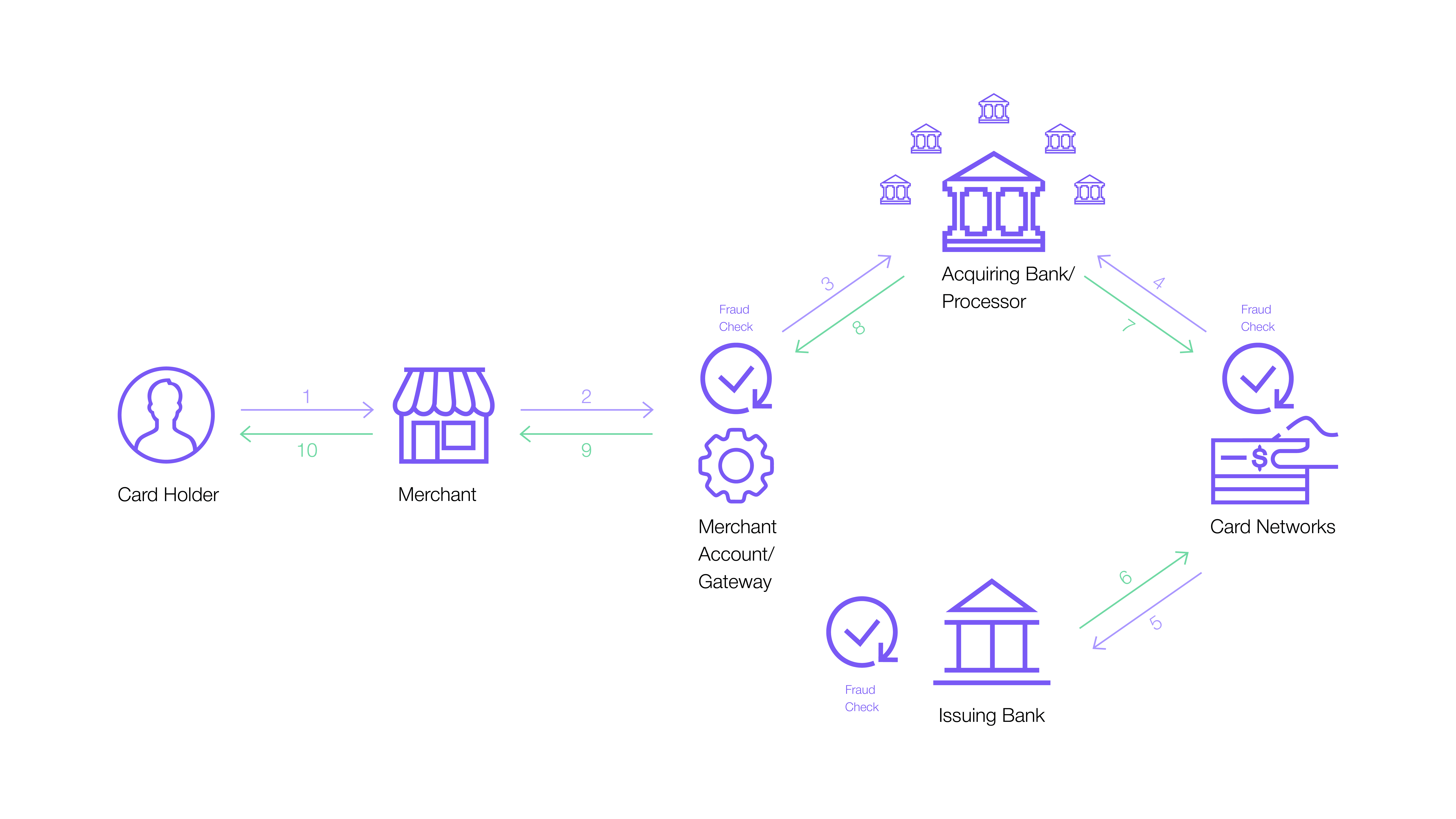
FinteqHub is a financial instrument, namely a payment gateway that only directs the payment and does not interact with the money of the online store, being a technological intermediary when making a payment.
The company is a reliable and flexible partner. At the same time, the brand wanted to reflect that the product will provide security and high-quality services thanks to deep experience in the iGaming payment system.
We tried to reflect all the meanings laid down, and that’s what came out!
What was the train of thought?
Reliably, clearly, and concretely – this is how owners of large businesses strive to communicate. But at the same time, they feel a high risk of being deceived and thrown with a broken payment system.
Therefore, our key message showed that FinteqHub speaks the same language as the audience, honestly and fairly.
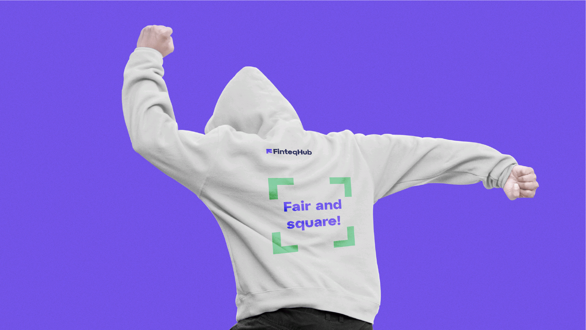
FAIR AND SQUARE!
And here’s what happened!
The payment gateway only directs the payment and does not interact with the money of the online store, being a technological intermediary when making a payment.
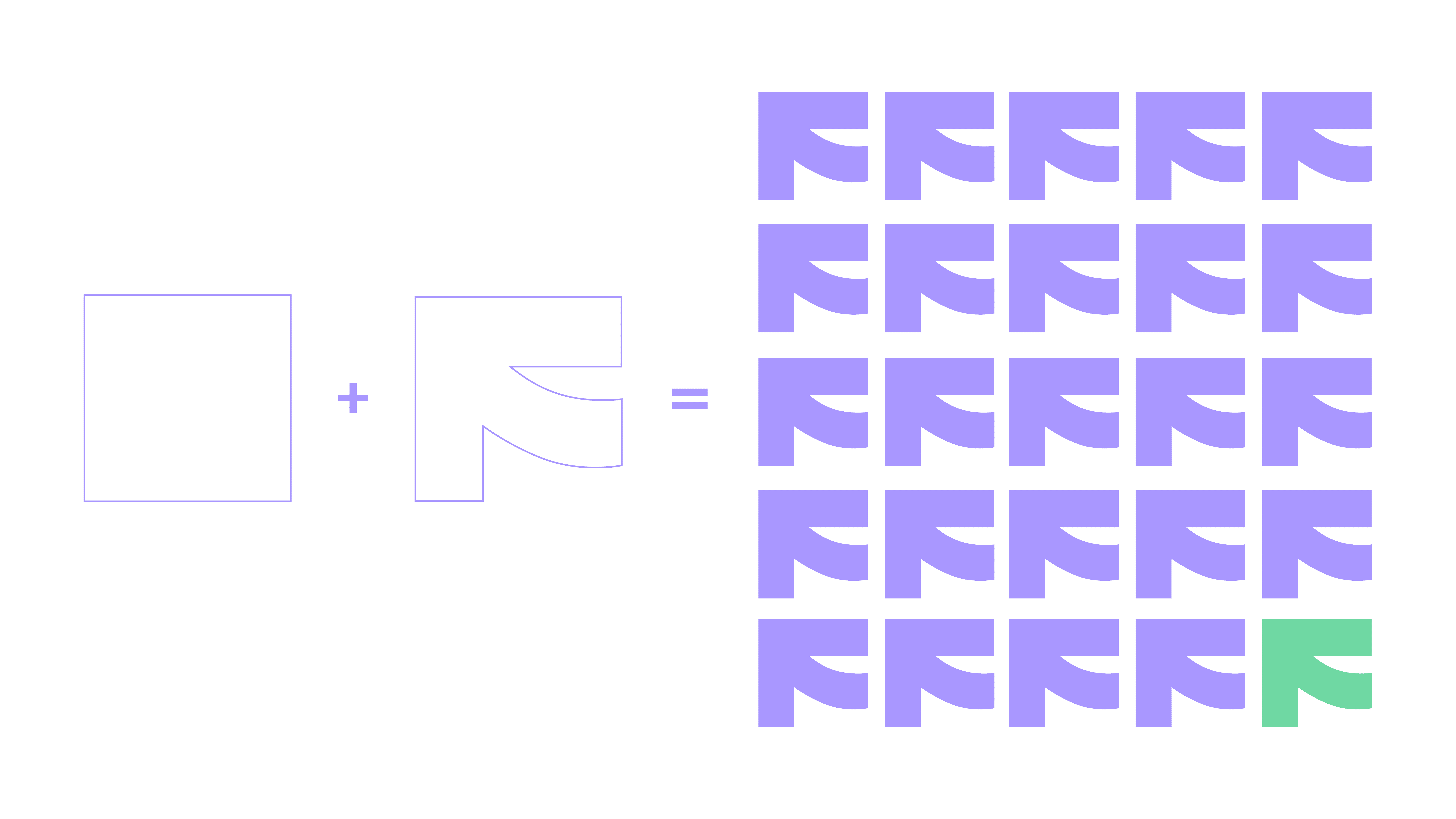
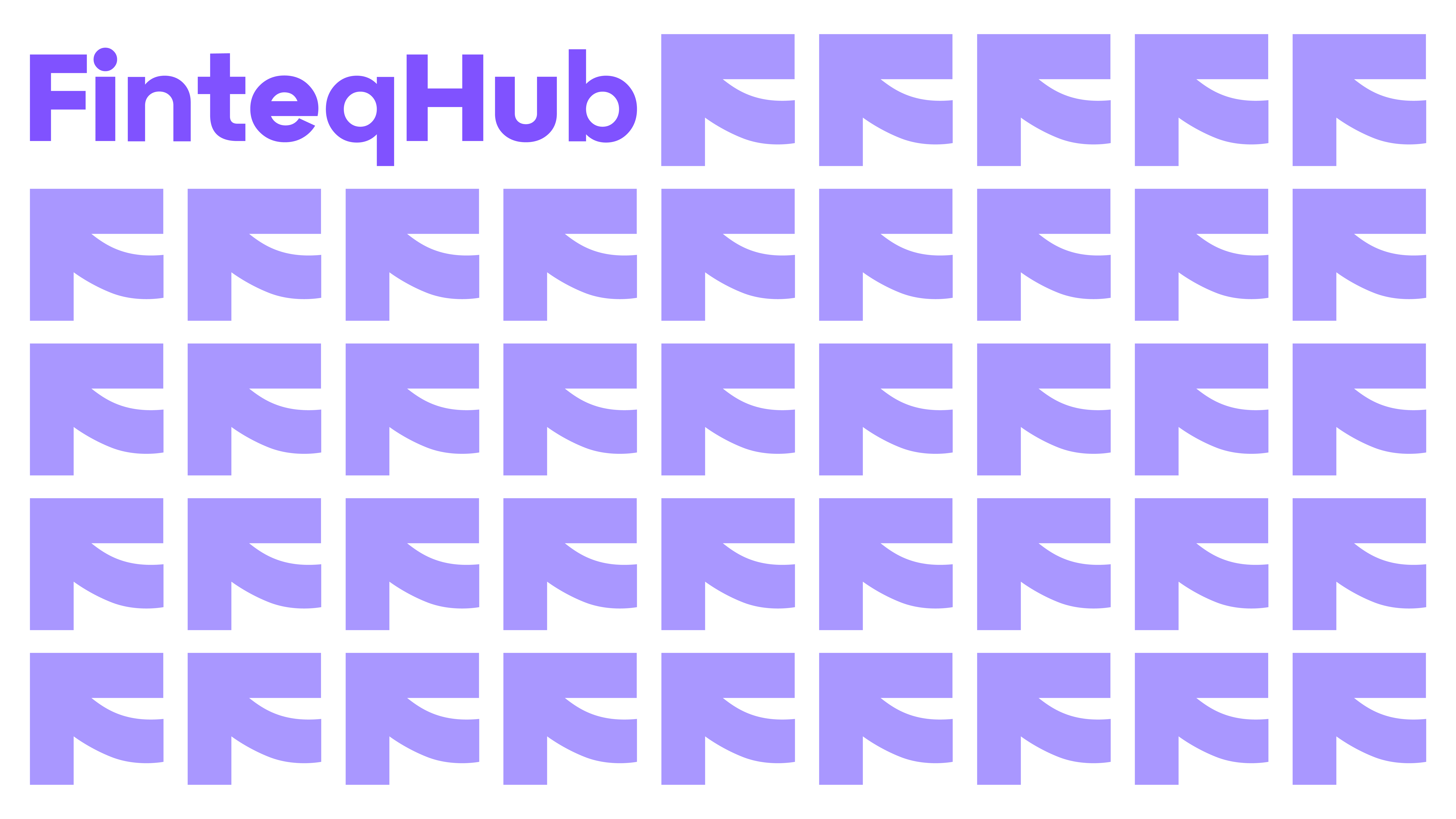
In this concept, we focused on the direct image of the data/money transfer between the two systems.
We chose the arrow as the main element associated with movement. It is a metaphor for the flow of funds and energy. We have made our icon stable and significant to pay attention to the reliability of FinteqHub processes.
The idea of the identity



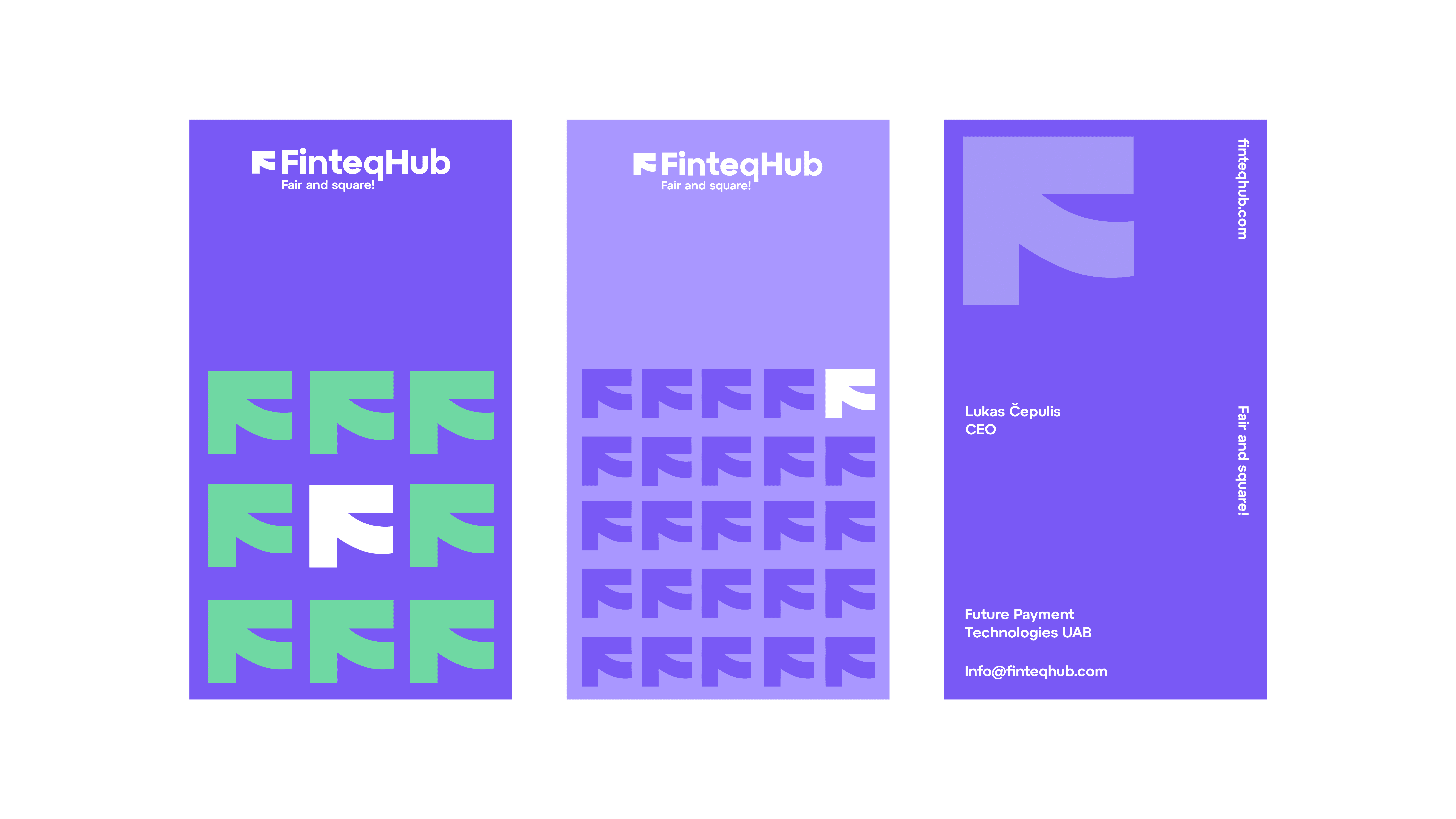
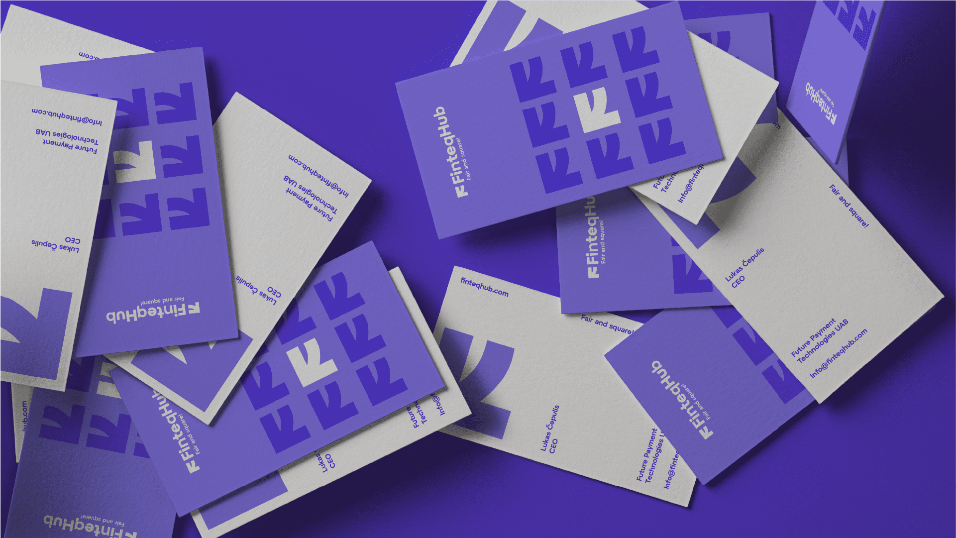
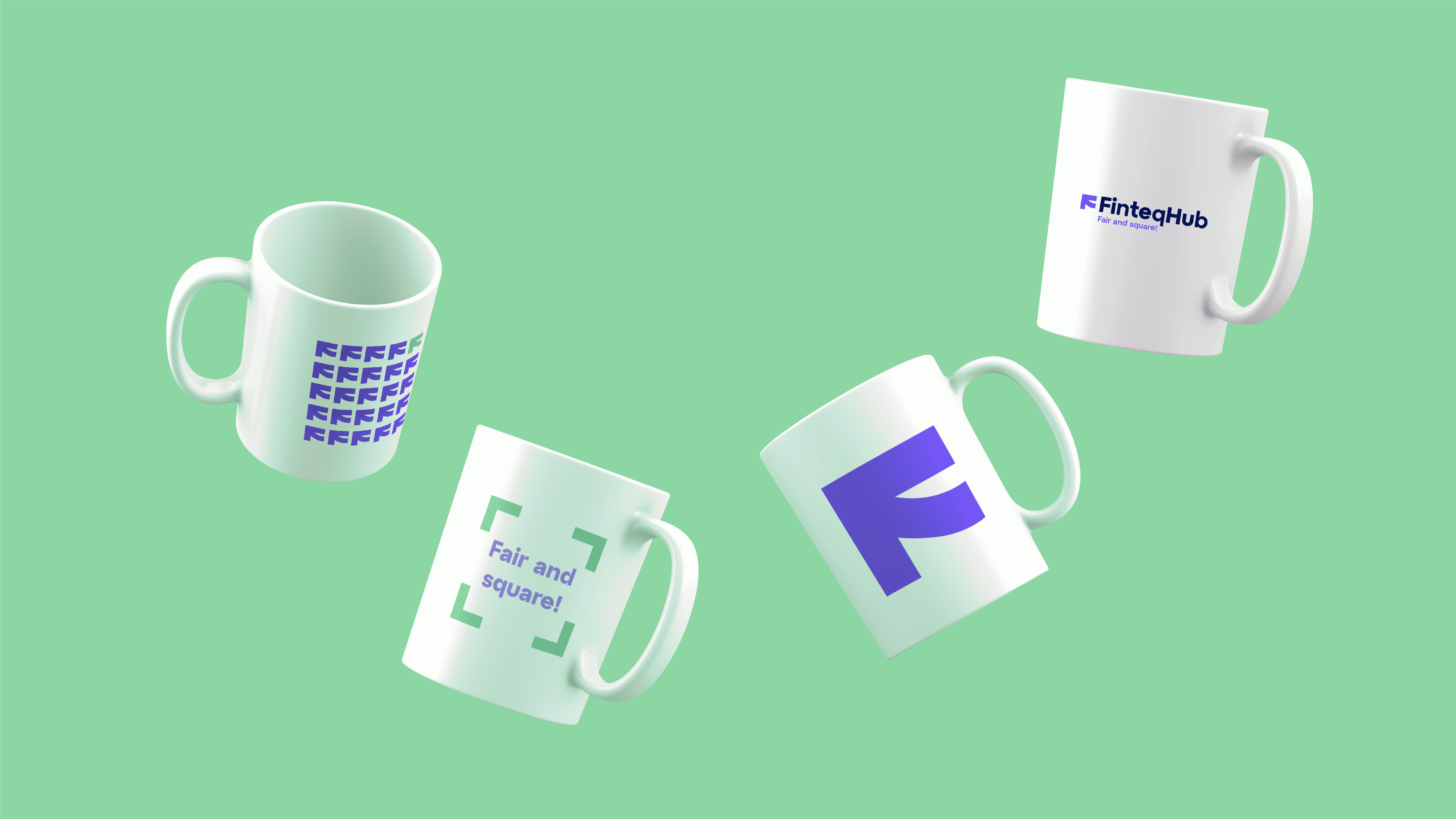

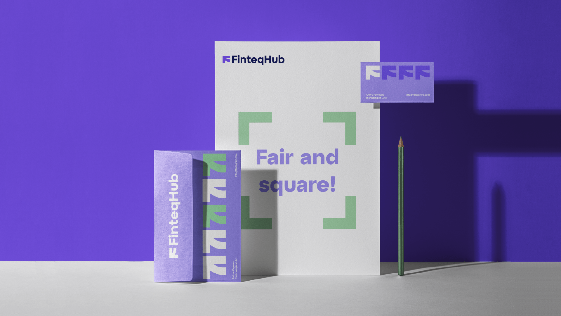
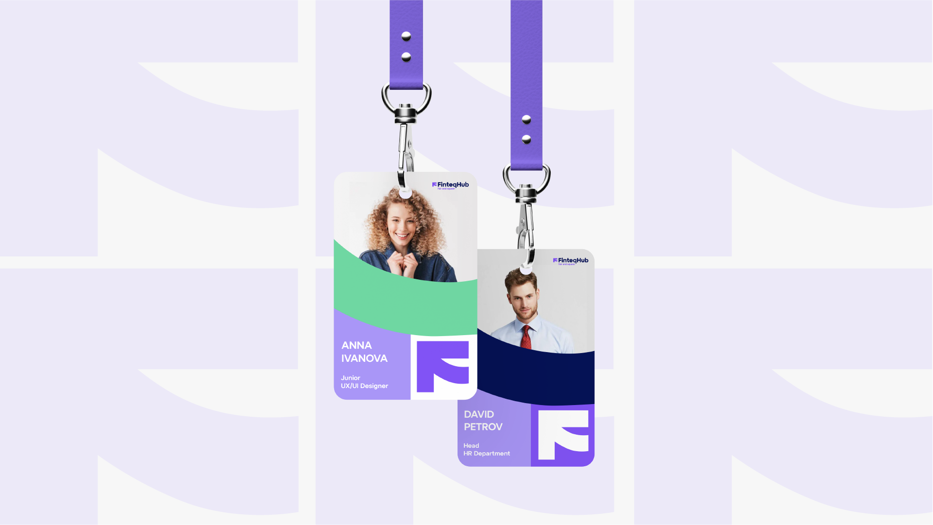
Done in 32 days:
Slogan development — 5 days Logo development – 6 days Corporate identity development – 10 days Guideline development – 11 days
Credits:
Creative Director — Denis Misyulya Art Director — Olga Lobanok Graphic designers — Tatiana Shinkevich, Arina Zhuravkova, Yulia Makarchuk Creators — Anastasia Eliseeva, Vitalina Dubitskaya


