Porsabor — branding of the ice cream café in Tenerife
Client: PorSabor
Task: Creating a brand from scratch
About the brand:
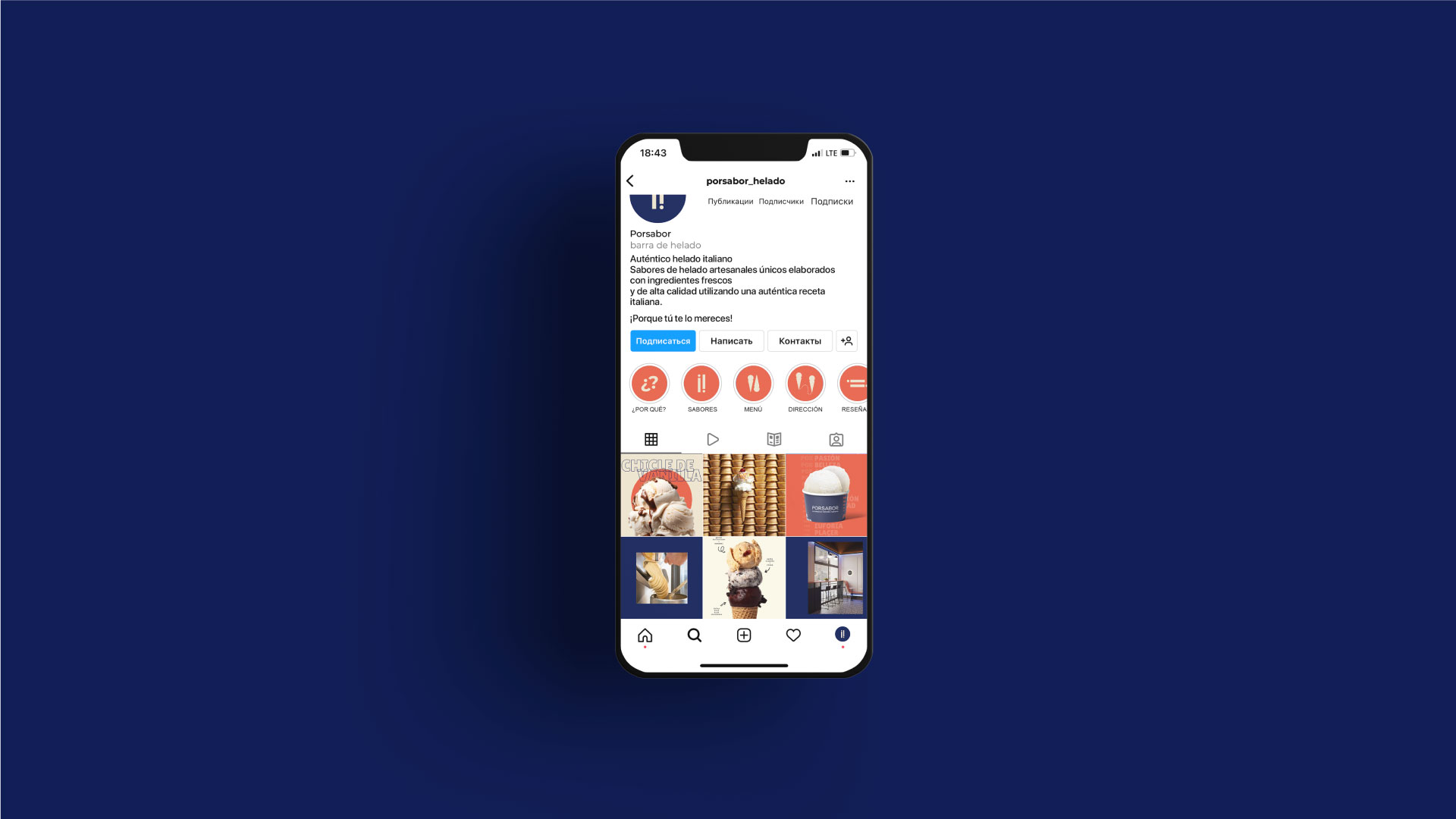
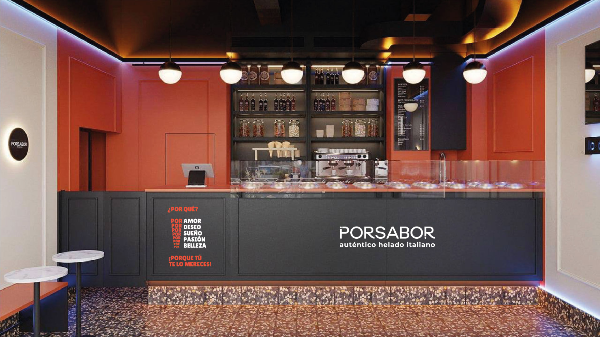
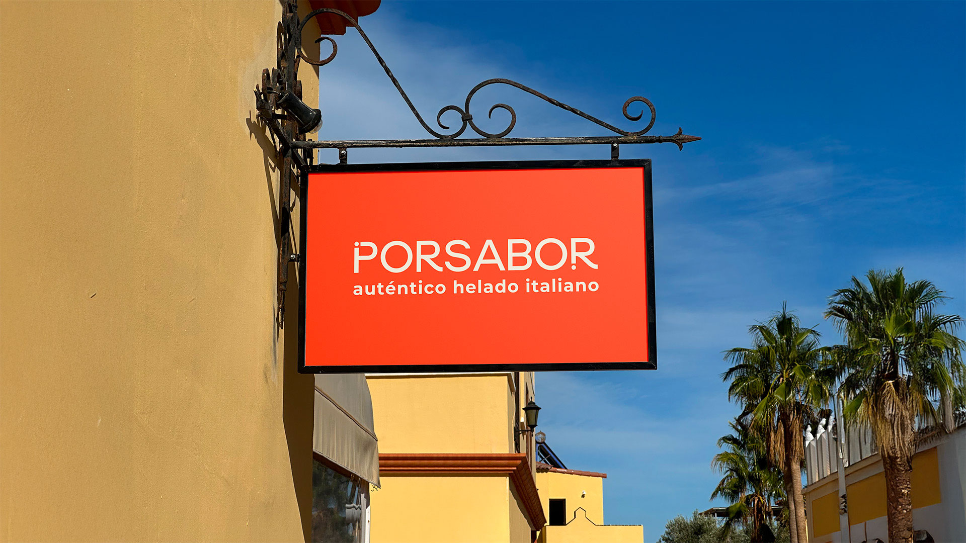
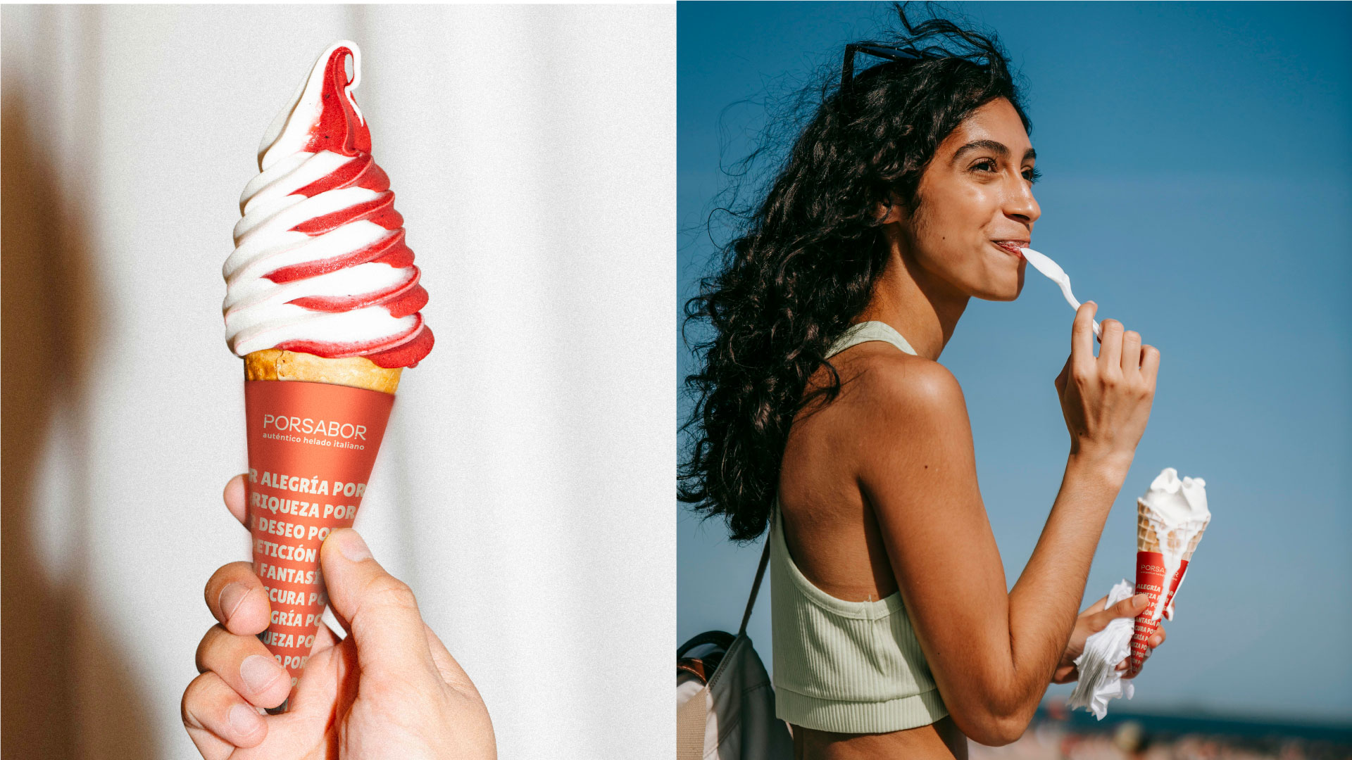
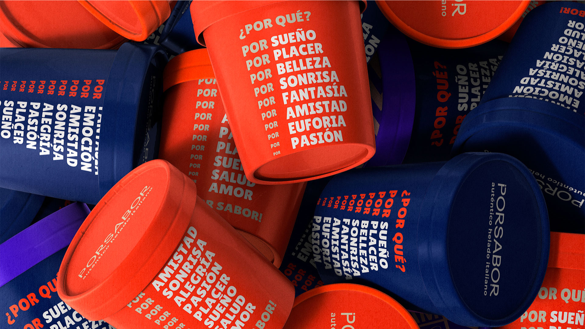
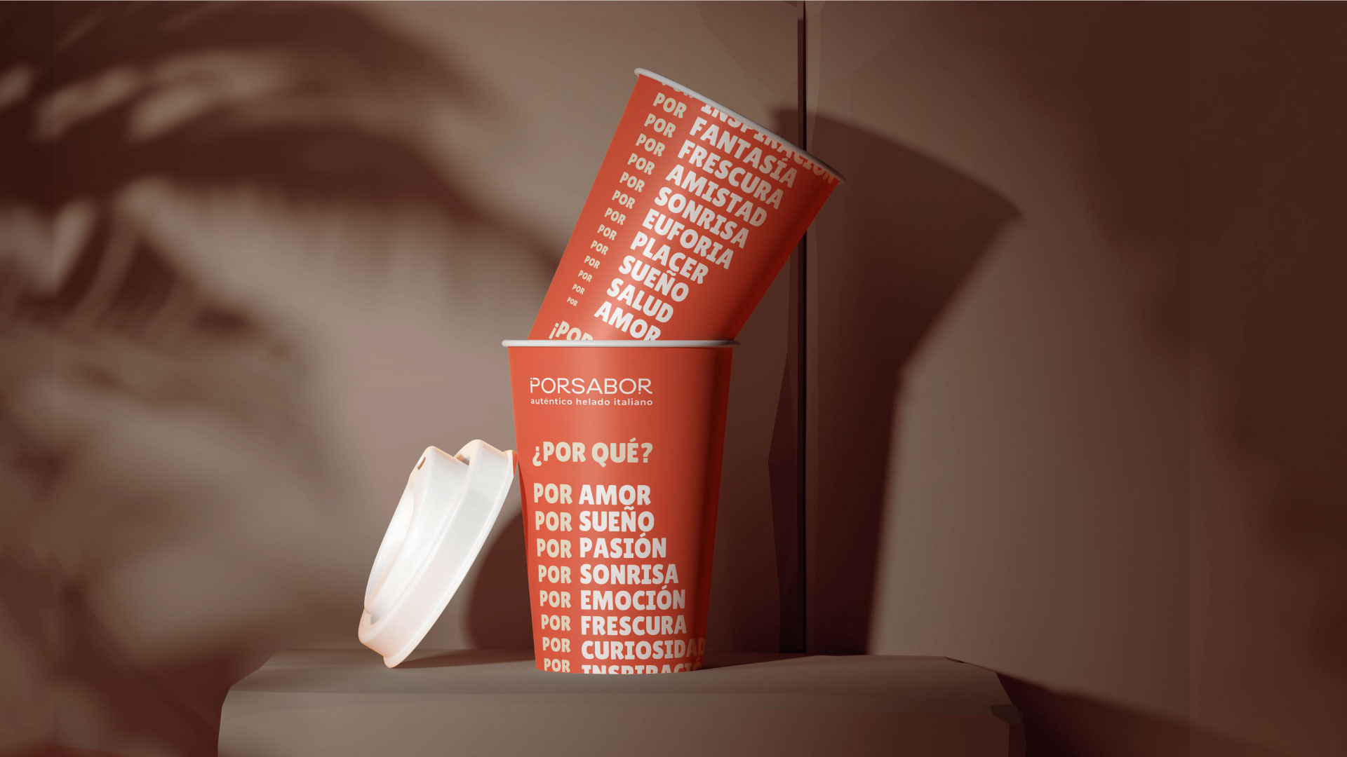
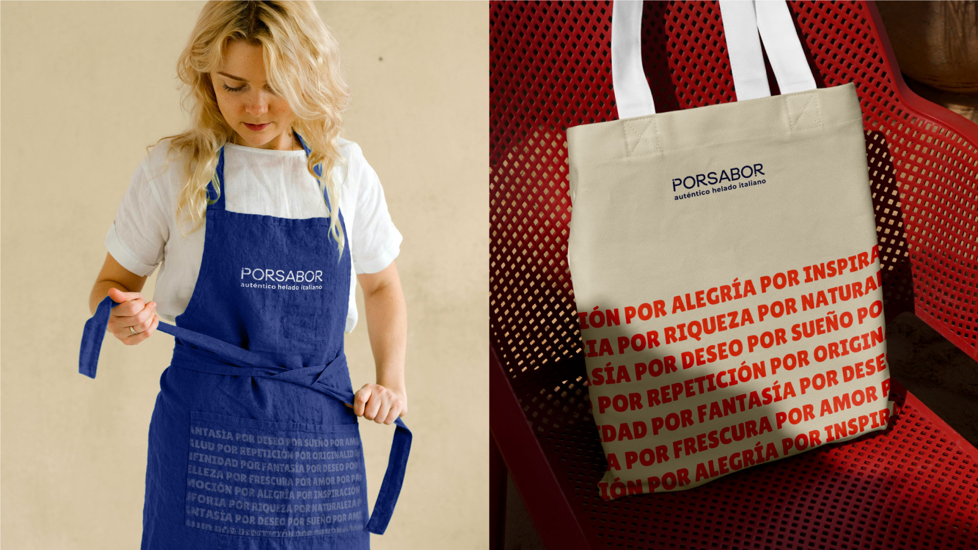
Porsabor is a new place in Tenerife. The identity is based on Spanish communication. The unique elements of emotional communication ¡! were incorporated into the logo itself. They also became the key elements of the corporate identity in combination with the emotions we get while enjoying ice cream.
Naming:
The brand’s name is formed from a combination of the Spanish words «Por favor» (please) and Sabor (taste), which create a new meaning of «for taste» and «for the sake of taste», «because of taste».

What PORSABOR is:
It is a brand of premium craft ice cream made from fresh, high quality ingredients according to an authentic Italian recipe. PORSABOR is a taste of emotions for which we are ready to do anything.
Color:
We used the colors as a symbol of the combination of sun and cold. These are those emotions and desires that you have when you would like to pause and enjoy a cold and very tasty ice cream.
Outcome:
As a result, we developed the brand and identity of the ice cream café from scratch, which has become an iconic place of Tenerife, attracting both locals and tourists with its unique combination of premium quality and vibrant emotional communication. Created identity has made Porsabor a beloved destination for those seeking not just delicious ice cream, but also a memorable experience.