There’s a moment in every creating a cafe brand project where someone at the table says: “Let’s just make it look nice.” I understand the impulse. Nice-looking things feel safe. But in the food and hospitality business, “nice” is the most expensive mistake you can make — because it forgettable, and forgettable doesn’t fill seats on Tuesday afternoon.
Creating a cafe brand is not a design project with a strategy problem. It’s a strategy project with a design output. The sequence matters enormously. Get it backwards and you end up with something that photographs well for three months, then quietly dissolves into the visual noise of your street.
I’ve worked on cafe and restaurant brands across different markets and geographies. Two projects in particular — Porsabor in Tenerife and Burger House — shaped how I think about this work. Each one taught the team something different about what a brand actually has to do when it’s competing for someone’s time, money, and emotional memory.
What a Cafe Brand Actually Is
Before process, a definition. Creating a cafe brand is not your logo, your color palette, or your coffee cups. Those are expressions of the brand. The brand itself is the expectation you create in the customer’s mind before they walk through the door — and whether the reality inside confirms or contradicts that expectation.
Strong cafe brands do one thing consistently: they make a specific promise to a specific person, and they keep that promise at every touchpoint. The signage, the menu design, the music, the staff uniform, the Instagram grid, the take-away bag — all of it should feel like it comes from the same place, tells the same story, and speaks to the same human being.
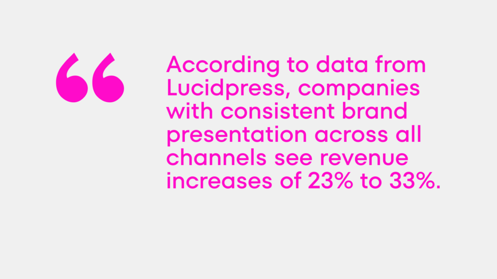
According to data from Lucidpress, companies with consistent brand presentation across all channels see revenue increases of 23% to 33%. In hospitality, where repeat visits are the economic engine, that number is not abstract. It’s the difference between a cafe that builds a neighborhood following and one that’s constantly fishing for first-time traffic.
Step 1: Know Who You’re Building Cafe Brand For
Every bad cafe brand starts with the owner. “I want it to feel premium.” “I like earthy tones.” “I think exposed brick is timeless.” These are valid opinions. They are not brand strategy.
Brand strategy starts with the customer. Who is the specific person who will choose your cafe over the one across the street? Not demographically — “women 28–40” tells you almost nothing useful. What do they value? What are they trying to feel when they sit down with a coffee? Are they escaping something or celebrating something? Are they working, or deliberately not working?
This is the brief. Everything else — name, color, typography, imagery, tone of voice — flows from having answered this question honestly.
Step 2: Find the Positioning No One Else Owns
Every street has cafes. Every city has hundreds of them. Most of them describe themselves with the same four adjectives: cozy, quality, authentic, local. The communication landscape is saturated with sameness.
The competitive mapping stage of creating a cafe brand is about finding the space that’s genuinely available. Where is everyone in the category going left? What’s being left unsaid? What emotional territory is nobody credibly occupying?
Communication Compass was a perfect fit here. It’s a tool that helped us understand where communication could be conducted. But the most beneficial impact came from Evidence-Based Design. This is a methodology I developed for analyzing the competitive landscape during identity development. The foundation of Evidence-Based Design is a precise understanding of ideas, color vacancies, and market trends. This allows us to create the most accurate solutions for our clients.
The Porsabor Case: Building Emotion Into the Logo Itself
Porsabor is an ice cream café in Tenerife. The brief was to build a brand from scratch for a new location entering a competitive tourist and local market.
The strategic starting point was the name. “Porsabor” combines two Spanish words — por favor (please) and sabor (taste) — to create a new meaning: “for taste,” “for the sake of taste,” “because of taste.” The name itself already communicates the brand’s central idea: taste as a reason, as a motivation, as something worth doing anything for.
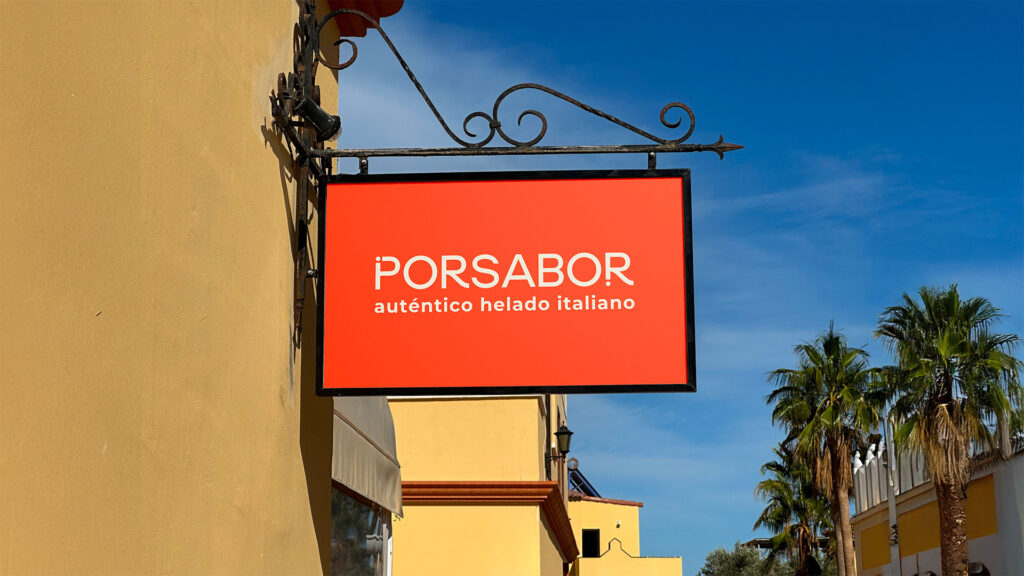
What I liked about this project was how the team embedded emotional logic into the visual system rather than decorating over it. The exclamation marks — ¡! — that frame Spanish communication became key structural elements of both the logo and the broader identity. They weren’t ornamental. They were semantic. They carried the brand’s personality: expressive, warm, distinctly Spanish, and unapologetically enthusiastic about pleasure.
The color palette was built around the tension between sun and cold — the exact emotional state of someone who wants to pause a hot afternoon and eat something extraordinary. That’s specific. That’s the kind of brief that produces a coherent identity instead of a collection of attractive components.
The result: Porsabor became an iconic place in Tenerife, drawing both locals and tourists — not just for the product quality, but for the experience of being inside a brand that knows exactly what it is. See the full project here.

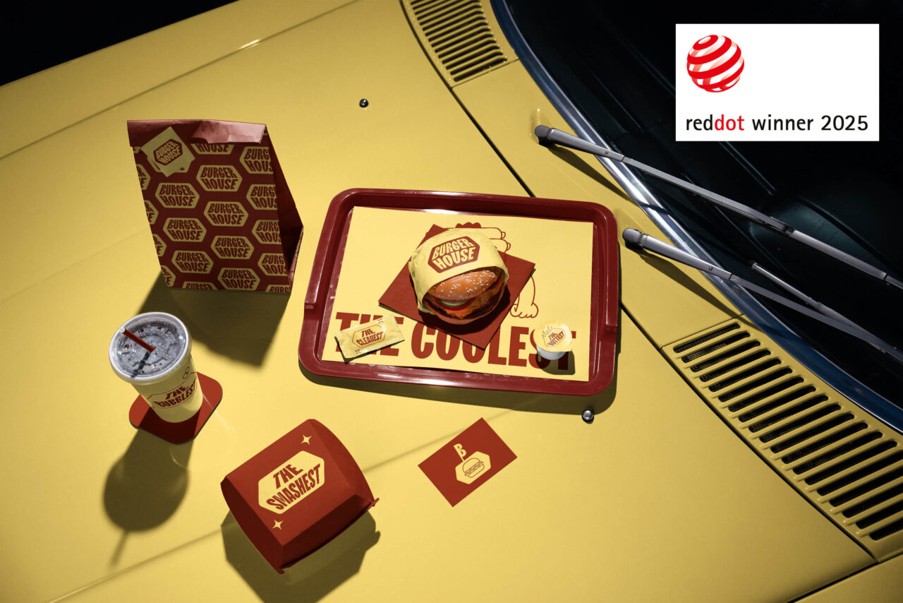
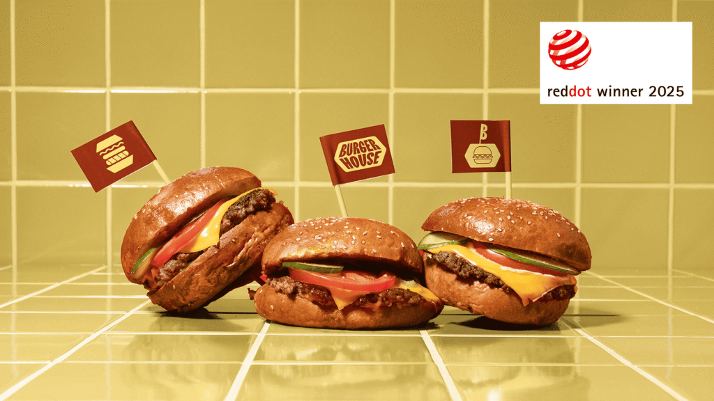
The Burger House Case: A Single Symbol That Held Everything Together
Burger House is a craft burger joint. When we came into the project, they needed their own visual language — something that felt genuinely theirs rather than assembled from category conventions.
The breakthrough came from the most literal possible starting point: where does a burger live? Its natural home is the box. So the burger box became the logo. Not metaphorically — structurally. The box shape became the connecting graphic element across the entire identity: packaging, signage, staff uniforms, posters, communication materials. It unified everything visually while simultaneously reinforcing the brand’s positioning around craft and character.
Beyond the logo, stylized characters were developed to communicate directly with the target audience. They appeared on chairs, T-shirts, and posters — creating a brand personality that visitors encountered physically, not just visually. The experience of being in a Burger House location was deliberately designed to leave an impression beyond the food.
The work was recognized internationally. The Burger House rebranding received the Red Dot Award: Brands & Communication Design — one of the most respected design distinctions in the world, evaluated by a jury of 24 independent experts on criteria of idea, form, and impact. In a category assessed on creative communication and innovative functionality, recognition at this level confirms that the work wasn’t just visually strong — it was strategically coherent. See the full project here.

Step 3: Build the Cafe Brand Identity System — Not Just the Logo
The logo is the beginning of the identity, not the end of it. A cafe brand needs a complete visual system: primary and secondary marks, a defined color palette with exact values, typography with usage rules, an imagery direction, and packaging and application guidelines.
Without those rules, every new execution — a seasonal menu, a social media post, a paper cup redesign — becomes a creative decision made in isolation. And isolated creative decisions, made by different people at different times, produce visual drift. The brand starts to look like it was built by a committee that never met.
The brandbook that codifies the identity system is what prevents that drift. It’s not a bureaucratic document — it’s a quality control tool for everything the brand produces from the day it launches until the day it chooses to evolve.
Step 4: Launch Internally Before You Launch Publicly
This step is almost always skipped. The brand strategy is finalized, the identity is approved, and the instinct is to go straight to the website, the signage, the grand opening campaign.
The problem: if the people who work in the cafe don’t understand the brand, the brand doesn’t exist yet. It exists as a file on a server. The actual brand — the one the customer experiences — is created in the interaction between staff and guest. If a barista doesn’t know what the brand stands for, they can’t embody it. If a manager doesn’t understand the positioning, they’ll make decisions that quietly contradict it.
Internal alignment before external launch. Run a session. Walk the team through the strategy. Show them not just the visuals but the reasoning behind them. Get them to understand who the customer is, what the brand promises, and why those choices were made.
What Separates Cafes That Build Followings from Those That Don’t
Seven out of ten restaurant and cafe patrons say brand relationships meaningfully influence their loyalty decisions (MenuTiger, 2026). That’s a remarkable number in a category where the product itself — coffee, food, atmosphere — could easily be the only deciding factor.
People don’t return to cafes purely for the product. They return for the feeling. For the recognition. For the sense that this place was made for someone like them.
Creating a cafe brand that delivers that feeling consistently — across the cup, the cup sleeve, the window lettering, the social post, the loyalty card, the staff apron — is not accidental. It’s the result of a deliberate process that starts with a question about the customer and ends with a system that makes the answer impossible to miss.
The logo can be beautiful. The coffee can be excellent. Neither of those alone fills a room on a slow Wednesday. The brand does that. Build it properly.