Blank sheets, artificial intelligence, and infinite motion — this is how you can summarize the actual trends in brand identity in 2022. «And what should I do with this information?» — you may ask, and we can give you the answer: — pay your attention and know:
- what style allows you to sell your product more expensive,
- how not to spend a few million dollars on a font,
- how AI pretended to be an employee of a large Moscow agency for a year and even completed 20 projects.
Are you ready?
1. MINIMALISM OR VOID?
A little bit of both. «Less is more!» — is one of the main manifestos of minimalism proclaimed by Ludwig Mies van der Rohe in the first half of the 20th century. The fewer elements design has, the more attention each element gets, and the more meaning you can put into them.
The simplicity of design catches the eye and helps to read the brand message better and understand a product or service. It is all thanks to the effect of «cognitive fluency.» To put it simply, our brain perceives better the things it already knows. And that’s why it’s so pleasant to look at the simple images and shapes.

So, how does it work? Your retina converts visual information into impulses. They are directed to appropriate photoreceptor cells in our brain to transmit information about light and color. The more color and light variations are in front of the human eye, the more work the brain must do to process the information. Thus, using understandable and familiar images and forms in design makes perception easier.
Here is a simple example: the logo redesign for the TGI Fridays restaurant chain. The logo form has been dramatically simplified, and punctuation marks and unnecessary details have been removed. Thus, the designer has managed to make it easier to perceive and read while at the same time keeping recognizable elements of the brand identity of a widespread chain.
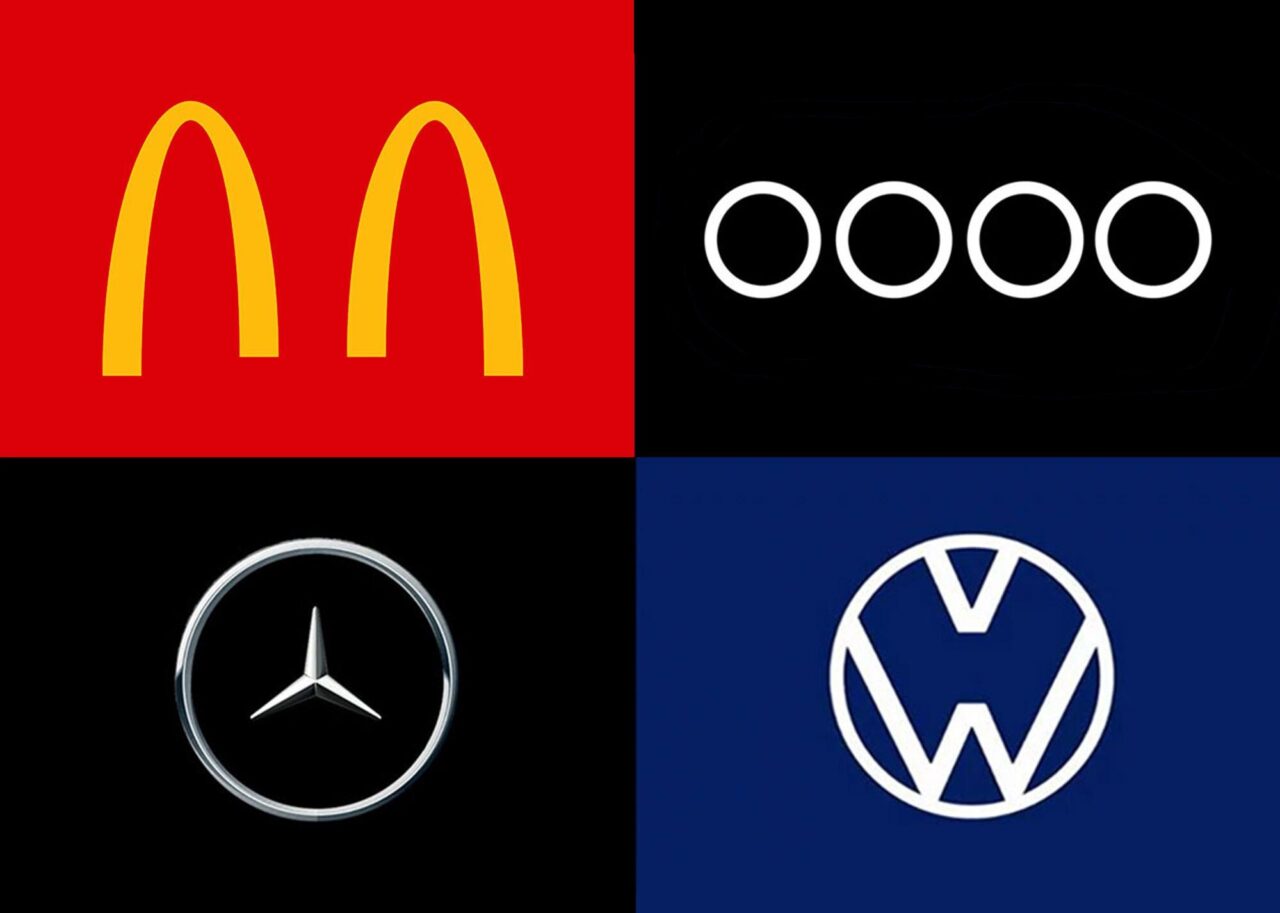
While some designers are stressed that they will have to explain to their clients that they are not buying an empty space, we insist that emptiness does not mean meaninglessness sometimes, it is more eloquent than any picture or text. For example, at the beginning of the pandemic, many brands effectively used empty spaces to convey the mood of the lockdown and remind the importance of observing social distancing measures to the public.

The image of emptiness has been actively used before. For example, the Alzheimer’s Nederland Charitable Foundation used disappearing letters to visualize the problem of people with dementia: their memory fades away.


Another successful example is the Open Space project. An empty rectangle with overlapping letters creates this «empty space.» Simply, understandably, without extra details.


Minimalist design is versatile and perfectly suited to packages, websites, logos, and others. Another advantage of minimalism is that it makes the product more expensive.
Emptiness is a trend in 2022, and it will remain so for a long time to come.
2. MORE ATTENTION TO FONTS
Today, more attention is paid to fonts. Moreover, many companies strongly reject excessive decor and focus on their unique font.
The font is one of the key elements of brand identity. A corporate font together with the company’s logo can define the character of a corporate style.
Thus, in one of the projects, «Medusa» — YouTube show «Radio Dolins» — the designer has put the excise typography as the foundation of the brand identity. Only the distinctive, recognizable font Base & Bloom, the play of light and shadows — nothing extra.

Another excellent example comes from our practice — logo development for the Belarusian project «Афиша» (English equivalent «Playbill»). We used five unique fonts and successfully adapted them to highlight the essence of the playbill — so different for everyone.

The logo’s recognizable, easy-to-remember elements are visible on merch, social networks, and sites.
The font is a new brand. Many companies have developed their display faces and even text fonts to stand out from competitors. This has helped many to achieve two things:
- saving money on paid fonts (and, for international companies with huge advertising budgets, these are enormous);
- getting a unique font that fulfills specific tasks, stands out from competitors, transfers brand character, uses special symbols, etc.
A notable example of turning the font into the brand is the creation of the Yandex Sans text font for «Yandex.» Interfaces and communications of the company are present in all possible environments: information resources online, city advertising banners, digital devices (including smart watches), printed products, and much more. Therefore, do not use different fonts for different devices and media, a universal font has been developed that responds to the company’s numerous needs.

Netflix provided an exciting example of having to create its font. As the company grew, so did the fees for using the Gotham font. At one point, spending rose to several million dollars a year, and Netflix Sans was developed, which took over the aesthetic element of the brand in addition to saving budget.
3. DYNAMIC IDENTITY: VARIABILITY OR PERMANENCE?
Dynamic identity is a rule system that allows you to create many design decisions. It consists of two elements: a permanent — well-known one and a changeable one.
The dynamic identity was used before. Thus, the famous MTV already used this technique in 1980. The sign’s shape is unchanged, but the background, textures, and colors are constantly changing. Brand clarity is preserved.

Today the dynamic identity is more relevant than ever. The consumer gets tired of the abundance of familiar images quickly. That’s why it is essential to find new solutions that are fascinating and surprising while leaving the image simple and clear.
Another excellent example is a dynamic brand identity for Melbourne based on «M», in many colors.

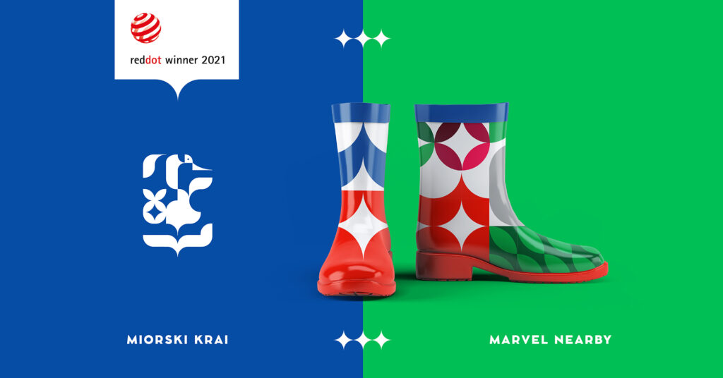
It’s not just the shape of the logos that can be permanent. Creating a tourist brand for the Miory district (Vitebsk region, Belarus), as a foundation, we have chosen a specific set of colors and elements to build the communication.

We have identified one style-forming element — a cranberry leaf — and several supporting elements that have allowed us to shape brand core attributes: migrating cranes, swamps, wild cranberries, and architectural symbols.
All this has formed in a modular design system, based on which the visual images in the form of icons can be created, with the help of which it is possible to identify famous places of Miory district.
The developed modular system allows to transform of the primary identity for the tourist brand of Miory district into a dynamic identity for separate parts of the district and its events: City Miory, the villages of Leonpol, Ozeravki-Yelnya Ecological Path, and «Cranes and Cranberry» festival.

It was a challenging but exciting task. In 2021 Milk Creative Agency won Red Dot Design Award with its help.
4. KINETIC IDENTITY: MORE MOVEMENT
When creating a corporate style, another expressive means can be used — movement. For example, designers make typography, logos, and patterns to deliver brand messages effectively.
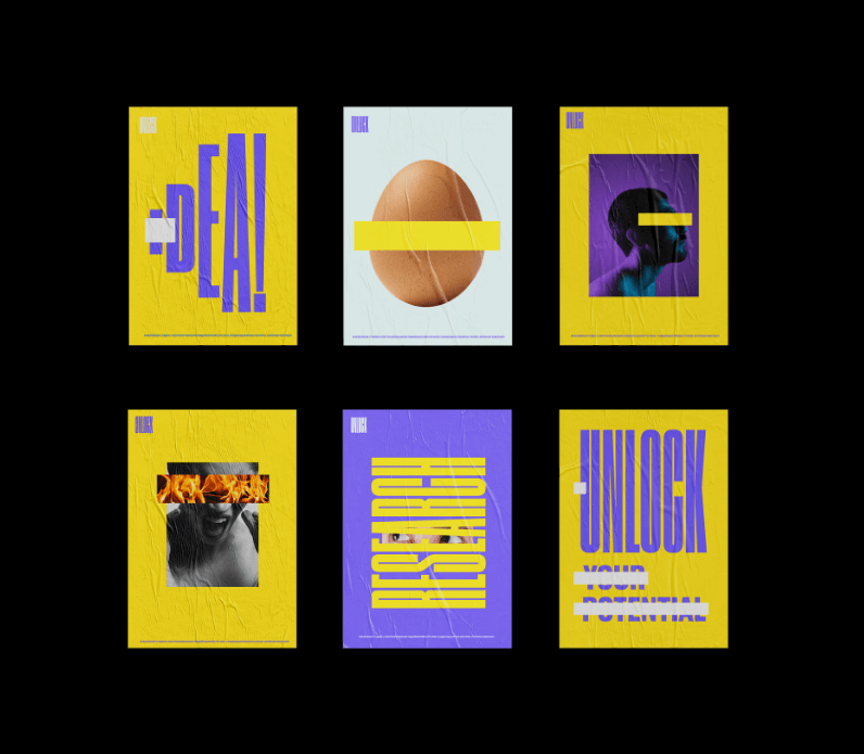
A notable example of kinetics is Unlock’s brand identity. The designer plays with a metaphor, revealing and overlapping the logo. The same technique is used in the preliminary design of the site and even business cards where the essential information is hidden behind a washed-away plaque.


Probably the best application of kinetics found in typography. The internet abounds with good examples of moving fonts. For example, DIA’s New York design studio has developed a generative platform based on a rigorous typographical foundation for the Squarespace website development tool. This tool allows the creation of infinite variations of the animations while preserving the recognition of the identity elements.
Another interesting example of the kinetic Identity by Dia is an advertising campaign for Johnnie Walker. Kinetic typography with the recognizable slogan «Keep Walking» company was put on screens in the major centers of New York, Los Angeles, DC, and Boston. The movement of the fonts refers to the characteristic ripple on the drink’s surface.
5. GENERATIVE IDENTITY. THE FUTURE IS HERE!
Generative identity is a breakthrough in the sphere of brand style creation. To put it simply, it is an approach to design where a person delegates a portion of the process to computer programs or neural networks (NNs). To do this, you must describe the parameters of the task, the possible limitations, and wait.
The main advantage of using generative identity lies in the freedom from limitations: human factor (sickness, laziness, or personal dislike of the designer); the influence of the external environment, fashion, and the opinion of trendsetters. Computer platforms do not get sick, do not go on maternity leave, do not experience crises, continuously study, and are available 24/7.
By doing so, NNS can generate an infinite number of design options, leaving humans only the choice of the most appropriate one. There is no designer on the planet with this level of KPI.
A striking example of generative identity is the artificial design intelligence by Nikolai Ironov, Art. Lebedev Studio. The project was launched in 2020 and — taking all the security precautions — completed 20 commercial projects within a year. Customers and even some studio employees were sure that Nikolai was a real person working remotely.


Generative tools can also be used to automate dynamic identity. Here you can take the idol for the island of Nordkun in Norway as an example. Depending on the temperature of the air, the color of the logo varies, depending on the observer’s location.
Even though the Generative identity is now in its infancy, we are confident that shortly we will have many discoveries in brand style design.

6. ANIMATION AS AN IMPORTANT PART OF BRAND IDENTITY
We can see the steady growth of demand for animation since 2017. In 2021this trend is even bigger and is touching almost all branches of the brand identity design.
Animation has several advantages over static images:
1. Conveys the brand’s idea faster. Animation videos are more evident.
2. Better hold the consumer’s attention. We can safely say that any visual movement triggers the audience twice as well as a static image.
3. Contains more information. When you want to convey a problematic idea, animation always wins.
Animation is used everywhere: in the presentation of the product to the audience, in videos about the company (for clients and consumers), in video instructions, infographics, and gifs for e-mail, and social networks.
The best example of animation in the corporate style is the identity of the Digital Year in Tatarstan 2022 from Art. Lebedev Studio. It is noteworthy that AI Nikolai Ironov, about which we wrote above, participates in the work of the project.
Important: unique videos and gifs are better ranked by search engines, which allows for attracting more traffic to the site.
Animation was not just used to make videos. Microanimation is a trend. These include progress bars, animation of content loading, changes in the status of elements during cursor hovering, etc. By introducing all this into the structure of site design, you simplify navigation for the user and, in some instances, push him to the actions you need.


Even the company’s animated logo when downloading the application or site helps to ease the wait and get better acquainted with the brand.

It is worth paying attention that the pandemic has made adjustments in all spheres of life, including promoting goods and services. Social isolation requires new ways of communicating with consumers, colleagues, and partners, and animation — in promotion, training, and communication — is more relevant than ever.
7. REAL-LIFE GRAPHICS
The use of graphic forms and real-world object interpretations helps to create vital elements of brand identity.
Thus, the memorable shape of the Dovzhenko-Center in Ukraine the designer has transferred to the logo and has expanded it into an identity. The recognizable outline of the building is perfectly read on stylized posts on social networks.

The transfer of graphics from real life was also used to create a brand identity for the Centre Pompidou in France.
Trends can and should be taken into account in developing the brand identity, but they should not be blindly followed. In addition to relevance, corporate style should be scaled well. Otherwise, even the most fashionable concept is meaningless. Don’t miss a chance to learn about our dynamic and font identity, which we have created. Go to the page, take a look, and if you think it is suitable for your brand, don’t hesitate to contact us.


