Packaging development

Quality packaging development is one of the most important criteria for good sales. Good packaging design is intended to captivate the consumer, to interest him, to leave a pleasant impression — all this makes the process of consumption more pleasant and subtly encourages the purchase of goods.
Correctly selected designer packaging conveys the brand identity and reveals to the buyer the properties that the product possesses.
WE DEVELOP A PRACTICAL AND STYLISH PACKAGING THAT WILL STAND OUT ON THE SHELVES.
In order to create really high-quality packaging, production is divided into the following stages:
- Market and target audience analysis. We highlight the features of the product and develop a message that the packaging should convey.
- Selecting points of interaction with the audience. We develop a selling concept: by what means the packaging will influence the buyer and stimulate him to purchase a product?
- Development of creative ideas for design.
- Drawing the best ideas and concepts in the chosen style.
- Presentation of the results of work, from which the client chooses the most acceptable. If necessary, we add final adjustments.
- Clarification of technical details and features of packaging, preparation of a layout for printing
Creative design agency Moloko creates packaging for various products: food, drinks, cosmetics, clothes, and detergents. We make packaging that is designed to convey the most important information to the consumer and remain functional, convenient, and friendly at the same time.
WE DEVELOP CONCEPTS AND IMAGES FOR PACKING THE FOLLOWING TYPES:
- Branded paper, bags, and boxes for food
- Plastic and paper labels for bottles and boxes, tetra-pack packaging, cellophane bags
- Branding stickers for securing paper packaging
- Non-standard packaging
- Souvenir packaging
- Merch packaging
WE WORK WITH THE SHAPE AND TEXTURE OF THE PACKAGING WITHOUT LIMITING ONE GRAPHIC DESIGN.
A series of research needs to be done to make a package that works and increases sales. We do it according to our method — this is our evidence-based design.
Evidence-based packaging design allows you to base your actions on facts. We analyze the competitive environment by a series of parameters and, based on statistics, show why certain elements should be present on the packaging.
DURING THE WORK ON THE DESIGN OF THE PACKAGE, STANDARD ANALYTICAL REPORTS WITHIN THE FRAMEWORK OF EVIDENCE-BASED DESIGN INCLUDE:
— Determination of the color palette of competitors. This allows you to understand which color segments are free or which color segments can be used so that the consumer perceives your product correctly. At this stage, we also understand how many colors competitors are using in general.
— Determination of visual techniques used by competitors. We analyze 3D images, types, illustrations, and packaging shapes.
— Construction of a virtual shelf of goods, which allows you to reveal how a new product can stand out on the shelf and win the attention of the consumer.
— Identifying the marketing hooks that are embedded in the packaging. For example, the packaging contains information about reducing calories, etc.
— A shelf of a similar category of foreign goods is being assembled to understand the trends of foreign markets in packaging design.
So, thanks to research in evidence-based packaging design, we get the data that allows us to say what color the packaging should have, what should be placed, and how to distinguish the updated product from the competition. All conclusions are supported by facts from the research.
WHAT PACKAGING AND LABELS HAVE WE ALREADY MADE:

PACKAGING DEVELOPMENT FOR THE MASSTIGE «PURE BALANCE» COSMETICS LINE
Masstige’s «PURE BALANCE» series of face care cosmetics is a line of 7 products ideal for the daily care of problem skin. The skin has its own relief, it is unique, like the person himself — it is a celebration of individuality. This is one of the main reasons why we got absolute freedom and how we came up with the packaging design for this concept. We have created a graphic prototype of the skin. Each skin cell in contact with a cosmetic creates its graphics.
PACKAGING DEVELOPMENT FOR GOLDEN DROP SAUCE
When developing a line of packaging for sauces Golden Drop, we aimed to show customers that the packaging contains a delicious product made from natural ingredients. We managed to highlight the packaging on the shelf by using spot and atypical icons, using a pattern on the packaging, and bright color accents.


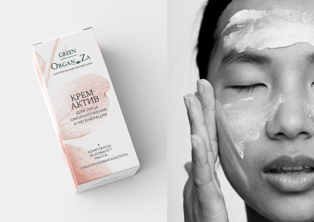
PACKAGING DEVELOPMENT FOR NATURAL COSMETICS GREEN ORGANZA
The line of cosmetics from Green OrganZa is 4 unique products for facial skin care. In the design of the packaging, we used macro images of plants, which helped to convey the naturalness of the products and made the packaging light and laconic. We also used minimalism in graphics and form.
PACKAGING DEVELOPMENT FOR SLAVYANKA CRUISES
It was important for the client that the packaging design was consistent with a single concept, but at the same time, each product had visual differences. We achieved this effect thanks to the idea of changing the time of day, with a distinctive color palette for each. We adhered to natural motives in the design of the packaging, since the natural component is associated with an eco-friendly direction — a natural product without additives, suitable for vegans.


REDESIGN OF THE LOGO AND PACKAGING FOR BIRTEA
In this project, the primary task for us was to develop a redesign of the existing tea logo: the previous version evoked not entirely correct associations, rather, with Rio de Janeiro, but not with Morocco. In addition, it was important for the client that the new sign was made in a more minimalistic, but at the same time refined design.


